One of the most fun things about yearbook is coming up with the look of the book. Nowhere is that more apparent than on the pages. So, as you grab the mouse, let’s think creatively about the layouts you’re going to use in your yearbooks.
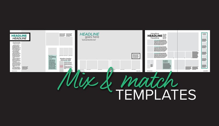
If you’re short on time, utilize the templates in Balfour Tools or StudioWorks+. Fall is in full swing and if you’re still needing templates, don’t be afraid to take advantage of ones already created. Find templates in the Balfour Tools or StudioWorks+ library. Switch the font to your theme’s type choices and add any graphic looks you’re carrying throughout the book. Don’t be afraid to adjust the design to give your own creative touch or tweak a module that needs additional photos or alternative copy.
Look at Pinterest or magazine design if needing inspiration. Not wanting to use the templates? Scour Pinterest or your local Barnes & Noble for ideas. There are tons of great yearbook ideas online and in professional magazines. It might be the perfect layout or a great module package. Take the idea and let it inspire a brand new or modified design.
Have a dominant package on the spread. Make sure that every spread has a dominant photo and accompanying story to anchor the spread. This gives the spread a central focus and helps the reader naturally move through the page.
Mix and match templates in different sections. Traditionally, staffs created one layout for each section. While this does provide consistency, it also gives the reader the same design over and over again. The monotony can cause the viewer to miss important content, or worse, skip the spread entirely. Instead, why not mix and match the templates? Take a spread in Academics and also use it in Student Life. Or take a cool sports page and run it in the organization section. The more you mix and match the designs, the more the reader will see a fresh look as they go through the book. As long as you’re using the same typography, graphics and colors throughout the book, the look and feel of the book will remain consistent.
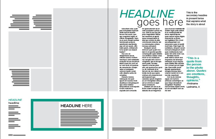
Make lots of modules and mix and match those on different spreads. On a similar note, mixing and matching modules and sidebars is another way to provide contrast in the design. Instead of running the same sidebar on every organizations spread, use it a few times and then include it another section as well. The staff could also create multiple sidebars and secondary coverage packages, and then pick and choose what pages the go on. Save all the module options in the library and staffers will have plenty of items to choose from as they design a spread.
Use multiple designs in the people section. As noted earlier, using the same design on consecutive pages can bore the reader. This goes for people pages too. Using the exact same layout and sidebar on every spread doesn’t encourage students to look closely at each page. Instead, mix and match modules and sidebars in the people section. Maybe one spread has a Q & A, while the next one has a small feature profile. Utilizing different sidebars in various sizes and placements on the page also helps when trying to adjust for different numbers of school portraits.
Vary the placement of dominant photos, stories and eyelines. After you’ve designed all of your templates, print them out and compare them. Are there horizontal, vertical and square dominant photos? Are they always in the same location? What about stories and eyelines? Verify that these essential parts of the spread are not always in the exact same place. It’s important to vary the content to keep the reader engaged in each spread.
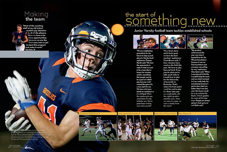
Glenn High School turned their football page into a showstopper by using a strong photo as a background image bleeding off the spread.
Add showstopper or wow spreads to break up the traditional design. Another way to jazz up the design is to add showstopper or wow spreads. These are pages that don’t follow traditional yearbook design. They might have 20 cutouts and quotes covering the whole spread or a giant photo that bleeds off the edges. These types of pages are meant to break out of the design. They can be fun topics like fashion or food, or traditional coverage topics like football or theatre that have an unusual design. (Hint, if you love the large background photo look, photos on dark backgrounds work great for this design. Think night sporting events, plays, musical concerts and stage dance performances. Also, sports like golf and swimming work well took because of all the grass and water, respectively.)
Designing layouts is one of the most challenging and rewarding parts of yearbook. The inspiration the students come up with will be permanently recorded on those pages. It’s a cool opportunity to remember history with a creative touch. So, open that spread, grab that mouse and have fun!