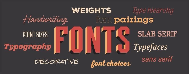
One of the best ways to illustrate a yearbook’s theme is through the font choices. Whether you’re going for a fun, flirty look or an elegant, classic feel, the typography can emphasize, clarify and support the theme. Consider these suggestions as you narrow your font choices:
- Select a font that has a large family with plenty of weights – Choosing a font family with lots of brothers, sisters and cousins (i.e. thin, book, medium, medium italic, etc.) allows you to have versatility, but the consistency of the same typeface. Use a book or regular weight for body copy, but consider using an italic, medium or condensed version for secondary coverage type. Mixing light and bold weights are a great way to add contrast in headlines.
- Establish a type hierarchy and stick to it – Once you choose a size and leading for body copy and secondary coverage, keep to those sizes throughout the book for consistency.
- Not sure what sizes to use? Try 9 to 10 pt for body copy, 7 to 9 pt for secondary coverage, 16-24 pt for secondary headlines and 48 pt and higher for headlines. Before submitting spreads, we recommend printing pages at 100 percent and comparing to the previous yearbook and other books to verify the size is big enough for readability, but not too large to distract from the other elements on the page.
- Consider adding an accent font – A fun, decorative or bold font can reflect the personality of the theme and accentuate the tone in a fabulous way. Just remember, it’s an accent for a reason. A little goes a long way.
Did you know? With a new year, we’re excited to provide a host of new typography choices. New font posters will arrive in a few weeks, but in the meantime, here’s the full list of our new fonts.

