
When it comes to covers, we tend to be swept away by the pretty fonts, cool designs and fancy cover applications. We’re so excited about the theme we sometimes forget the boring details. But there are a few cover and spine essentials integral to the yearbook’s historical function and its level of consistency.
First up is the cover.
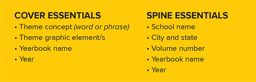
We know the cover should include the look and feel of the theme, but what exactly does that entail? Essentially, it should include the typography, colors and graphics that will be inside the book. When working on the cover, make sure the cover artist uses fonts you have and plan on using throughout the book. (If the cover artist uses a font you don’t have, get a copy or switch to type that is compatible with your font options.)
Just like with typography, the visual look continues with the colors and graphics. The cover is a precursor for all the visuals on the inside pages. If the graphic element on the cover is a series of squares, we shouldn’t see circles or triangles inside the book.
In addition to the theme connections, the cover should also include the name of the yearbook and the publication year. Usually, this runs small and in one of the chosen fonts (especially, if there’s more than one font and that second or third font has not been introduced on the cover yet). It’s not necessary to put the school name on the cover although you can if it’s a school tradition or you prefer it included.
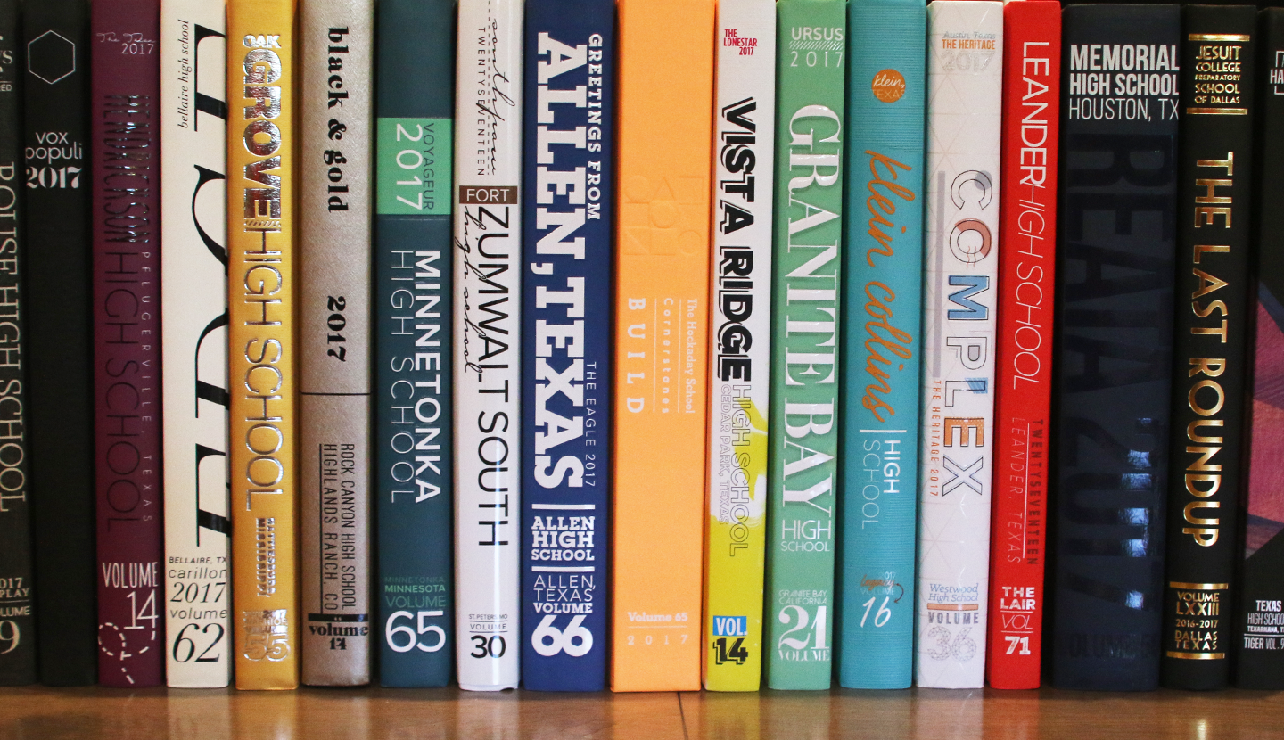
Don’t neglect the spine.
We’re so enamored with our covers that we sometimes overlook the spine. But that vertical strip is the first visual when a yearbook is on a shelf. Like the cover, it should have the look and feel of the theme. The colors, typography and graphics should carry over to the spine.
But the spine holds more than a visual presence. It provides information critical to the historical and reference functions of the book. The spine should include the school name, city and state, volume number, yearbook name and the publication year. Often, the city and state are missing from the spine, making it more difficult to differentiate between schools with the same name or to determine the school’s geographic location.
The volume number and year are also spine essentials. They let us know what year the book was published and the current volume number. Another overlooked aspect of the spine is the location of these two figures. Strive to keep the volume number and year in the same spot each year. This becomes an important visual when numerous volumes are placed together on a shelf. (Hint: Use last year’s spine as a starting point for the placement of the school name, volume number and year.)
Although some staffs add their theme logo to the spine, it’s not necessary. There’s plenty of other information that’s needed on the cover and the fonts, colors and graphics are a strong tie to the theme. Plus, the theme logo is featured prominently on the cover.

What about the back?
There’s no set criteria for the back of the yearbook cover. At the least, covers usually carry the colors and some graphics onto the back of the book. Some staffs opt to continue their cover treatment on the back (for example, a thermal cover might have the latent image on the front and back). Another option is to include the school seal or the mascot on the back, often blind embossed or debossed.
Whether it features air texture, a die-cut or UV coating, the cover should illustrate the theme and provide essential information. The old adage “never judge a book by its cover” isn’t the case here. We want you to provide all the necessary details for the preservation of your book’s place in your school’s history. When it comes to spines and covers, we’ve got you covered!
