Too many choices.
The term “overchoice” was a concept introduced to our vocabulary by futurist Alvin Toffler. It’s a term describing the difficult time people have making a decision when faced with many options. The inexhaustible number of typefaces to choose from is a perfect example of choice overload.
What’s the solution? Just because you have a lot to choose from, don’t select a dozen fonts to use. Limit yourself to two or three. Besides limiting quantity, there are other things to consider when choosing appropriate typefaces.
Your two primary considerations are legibility and readability.
Because they are meant to be seen at a glance, decorative typefaces have low legibility. For body copy and captions, choose a conventional serif or sans serif typeface.
Readability, on the other hand, is a combination of type size, spacing, color, tracking, width, etc. It is how the fonts are used and the overall impression the fonts create. (It follows that copy that is hard to read, won’t be read.) Communication is your goal. Style is a secondary consideration.
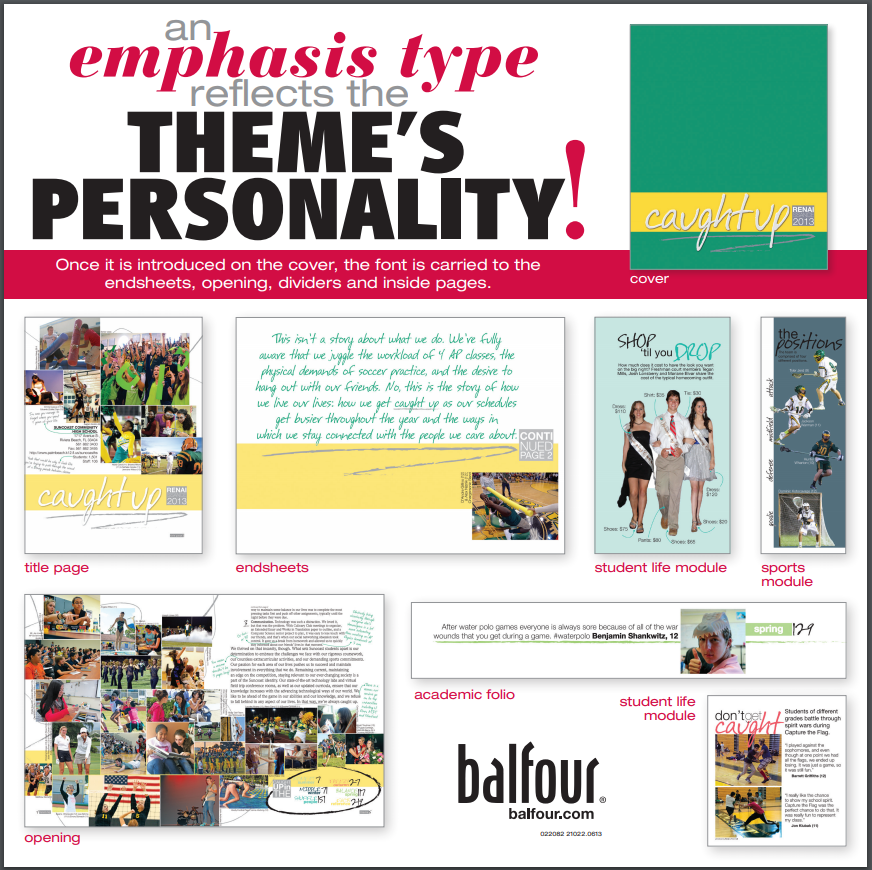
So what can you do with all the alluring, fun and decorative typefaces available to you? Use one of them as a “theme” typeface for emphasis, association and continuity. The meaning of the theme will be enhanced by a typeface that evokes a strong reaction and supports the concept.
Check out our handout on the use of emphasis fonts or read more here.
