Academic coverage tends to be the smallest and weakest section of a yearbook, but it’s the whole reason we walk through the schoolhouse gates. So, let’s take some time to focus on what happens from bell to bell.
Historically, the academic section of the yearbook has been the smallest section. It’s easy to see why. Classes aren’t as much fun to cover as football games, pep rallies and Homecoming spirit week. But academics is a vital aspect of the school experience. Heck, it’s the whole reason we’re at school in the first place. So, let’s give some props to English IV and U.S. History and hit the books.
Academics should take up 12 to 15 percent of the book. For example, let’s say your book is 200 pages after deducting the theme, ad and index pages. The academic section should be 24 to 30 pages, or 12 to 15 spreads. That’s a healthy amount of space to cover core classes, fine arts, foreign language, technology and other electives.
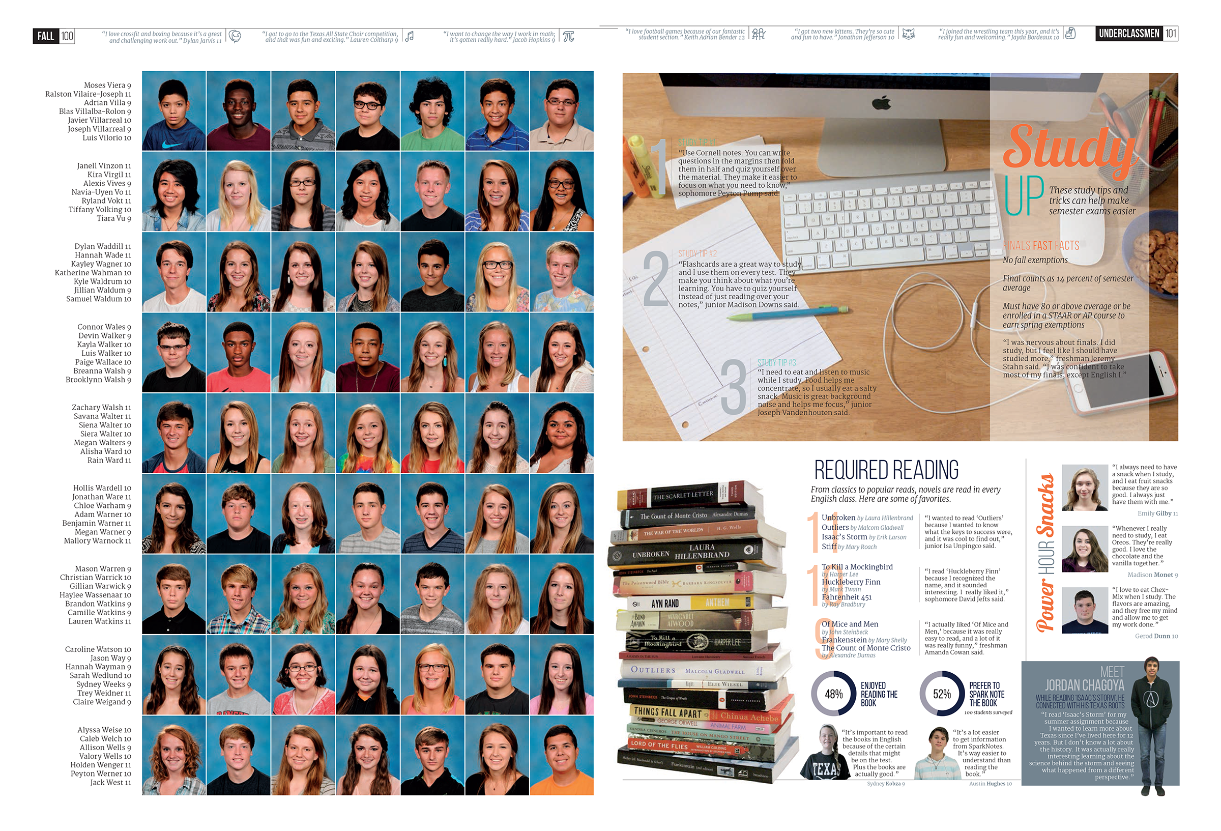 In 2015, Vista Ridge High School combined some of their academic coverage in the people section, like with this page on studying.
If 12 to 15 percent is more space than you have available, consider a few alternatives. Try running some of the academic coverage in the people section. This will provide more substantial coverage than typical people sidebars. You could also combine similar types of classes to condense the number of pages needed. Another option is to combine the academics and club sections since many classes overlap with extracurricular activities.
A common complaint about the academic section is the boring factor. Often the stories are weak (do you really want to write a story about math?) or the pictures are dull. We’d love to never see another picture of students taking notes or doing a PowerPoint. We also have a habit of not thinking creatively about the coverage—we do an English spread or a history spread.
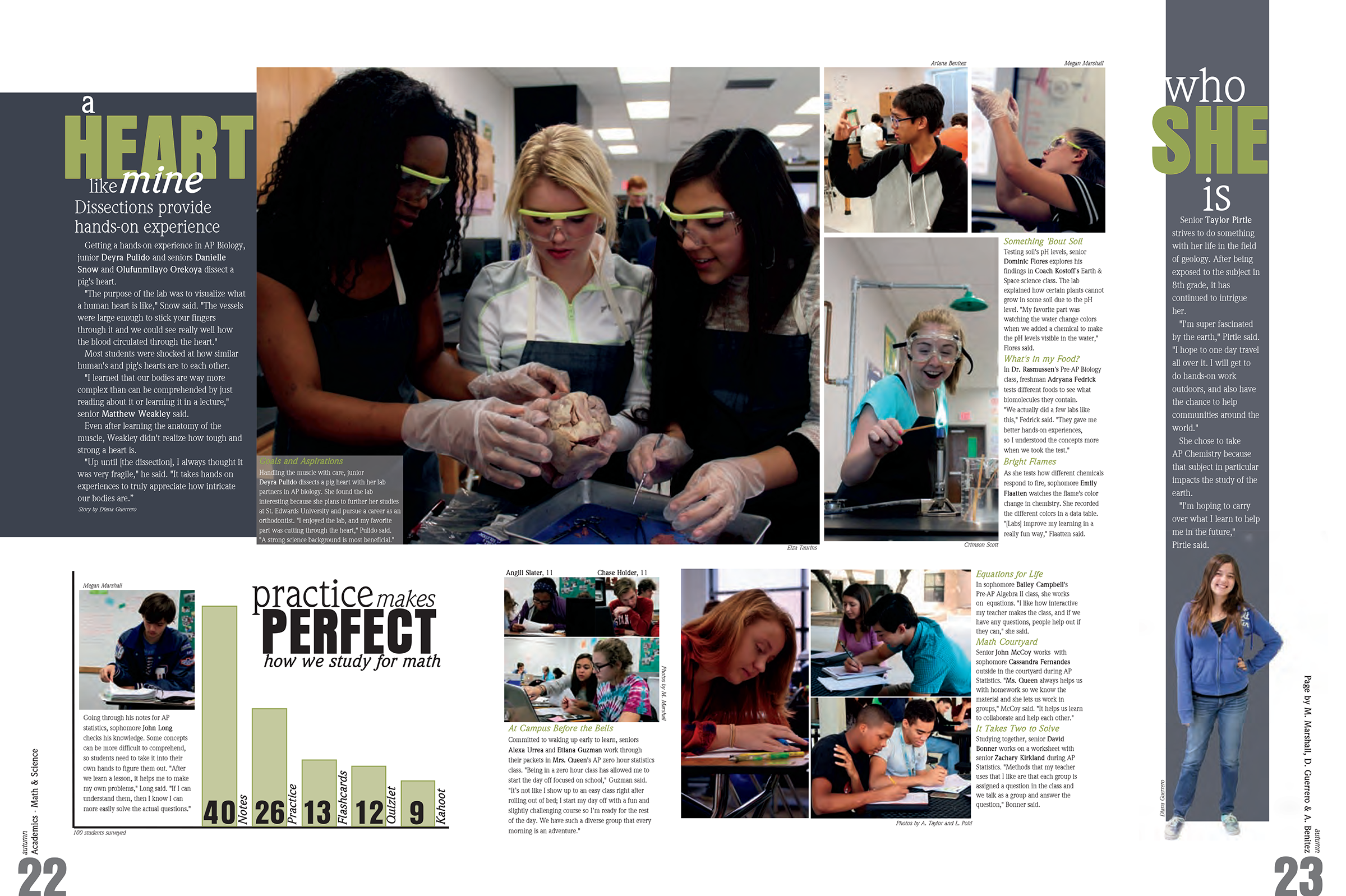 This 2016 Leander spread combined math and science coverage, focusing on experiments for the dominant package.
To combat these issues, try a more creative approach. Instead of thinking about academic coverage by the subject or the class, focus on a topic. This approach solves space, creativity and photo problems. For example, instead of doing the typical English spread, math spread, history spread, consider combining them on a core classes spread. Or include a projects and presentations spreads and use any classes that fit these criteria. The beauty of this approach is in lending itself to real photos. Students will be working with their hands, caught in what we call “the act of learning.” Say bye-bye to photos of taking notes, and hello to scavenger hunts, poster drawings, costumes and dioramas.
By mixing the classes together, a strategy called blended coverage, you’re saving space and minimizing the boring factor. Other ways to blend include spreads focused on:
- Foreign language classes
- Science experiments
- Creative classes (art, photo, creative writing, floral design)
- Business and technology classes (can run together or separate, depending on space)
- Real-world classes (culinary, shop, auto tech)
- Journalism (newspaper, yearbook, broadcast, photojournalism)
- Medical training (athletic trainers, health science technology)
- Electives (any electives, including less covered ones like speech, PE and health)
- College prep (AP, SAT, AVID)
- Field trips (any classes)
- Mid-terms (any classes)
- Studying (any classes)
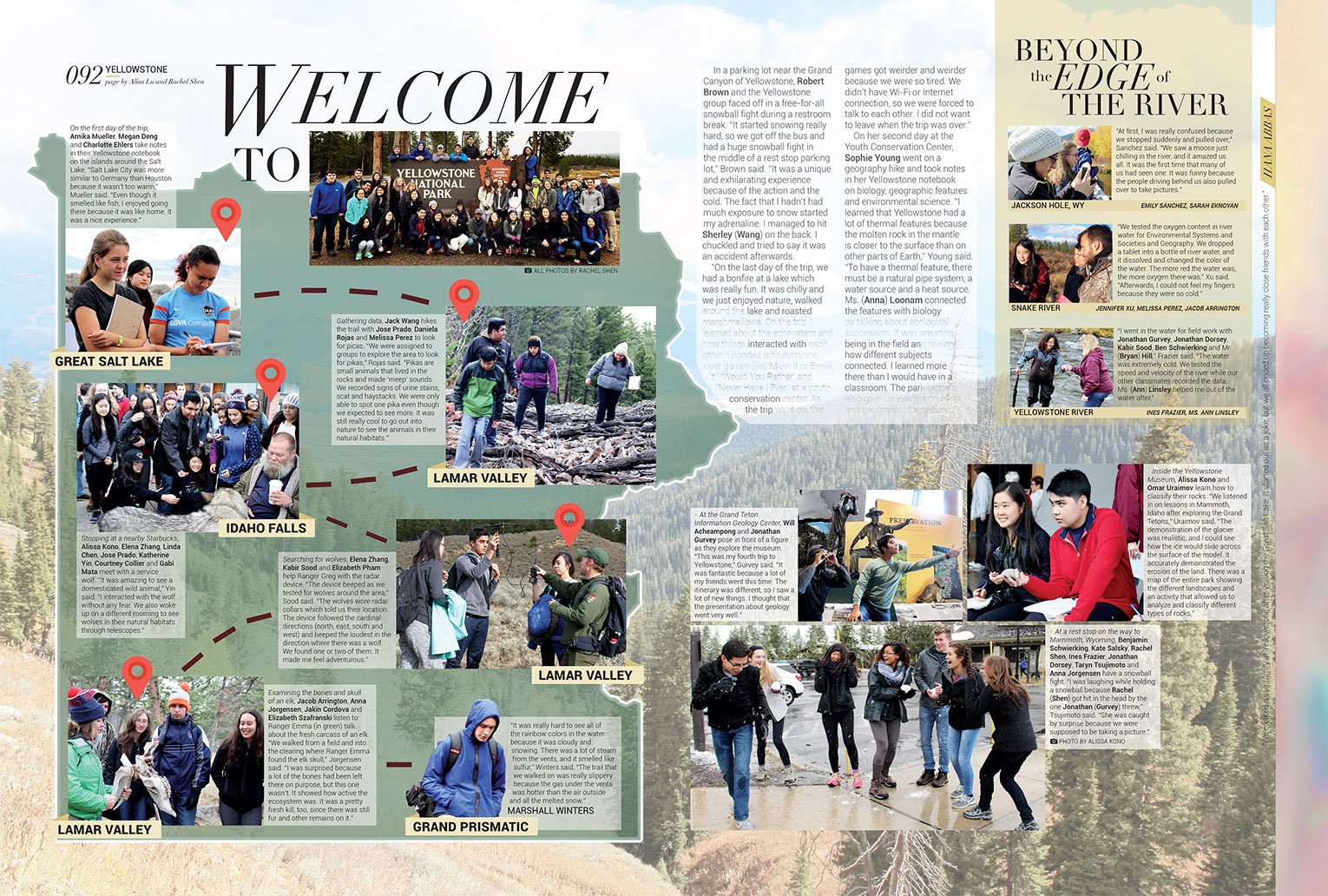
Bellaire High School featured a field trip to Yellowstone as part of their academic coverage in 2017.
In terms of design, use the most interesting class as the main story and photo package and run the other classes as secondary photos and sidebars. Another option is to substitute a traditional story with alternative coverage to give each class equal space. (Related: See our previous blog on ideas for alternative coverage.)
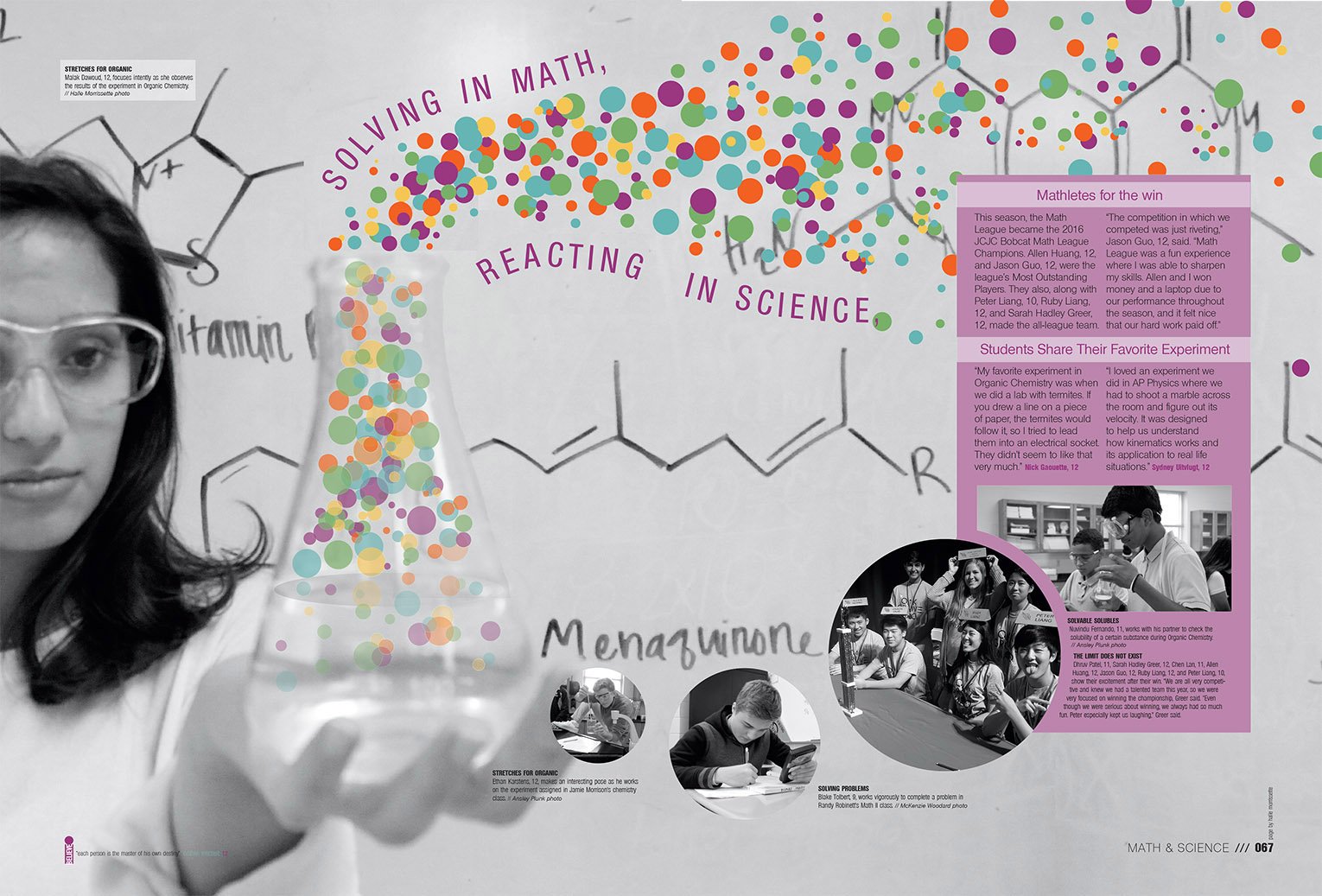 Using an illustration and black and white photos, the 2017 Oak Grove yearbook created an innovative math and science spread.
Another way to improve academic coverage is to think creatively about the type of coverage. There’s no reason a class spread couldn’t be a showstopper or “wow” design. Taking interesting pictures for foreign language spreads can be difficult. But if the classes have a food day, the images become much more interesting and lend themselves to a unique design. Consider running cutouts of all the ethnic foods students bring in and add quotes about the projects to add another layer of coverage. Similarly, an English page could have a knockout design and coverage by focusing on the books students read. Think of stacks of books cut out or students holding the books open in front of their faces.
Academic coverage doesn’t have to be boring or stuffy. It can feature gorgeous design and eye-opening coverage of your school. After all, we’re in school to learn. Why not show some of it?
