

Welcome to Tuesday Tips! Where we unravel the secrets of crafting visually stunning and meaningful yearbooks!
In today's post, we're shining a spotlight on the art of color planning – a crucial element in ensuring that your yearbook's color palette harmonizes seamlessly with its theme and aesthetic.
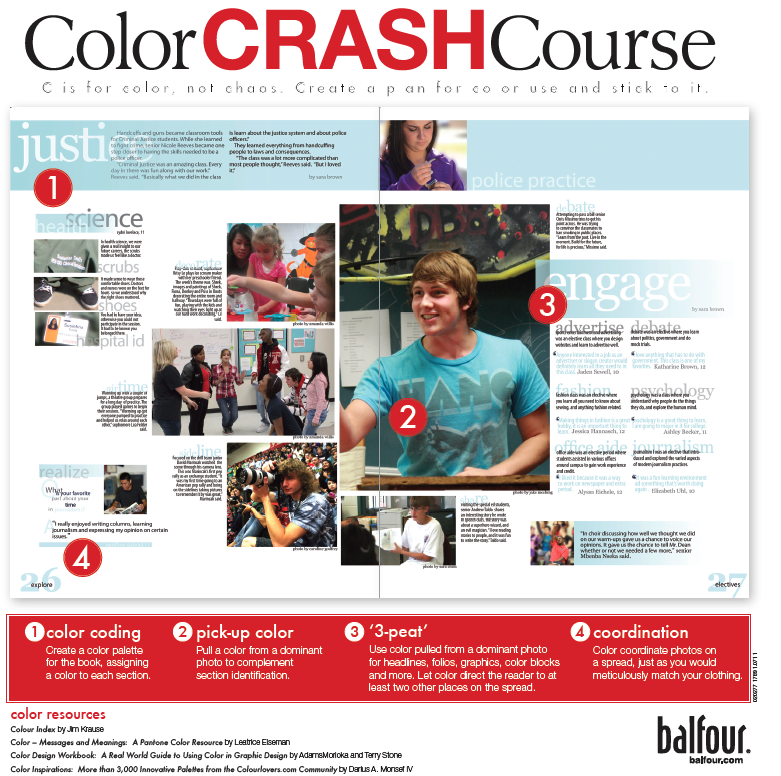
Color isn't just about aesthetics; it's about setting the tone and evoking emotions. That's why we're excited to introduce you to our invaluable resource on Studio.Balfour.com – "Color Planning." This Balfour Square delves deeper into the world of color coordination, helping you make informed choices that will enhance the overall impact of your yearbook.
Check out our Balfour Square - "Color Planning" below:
You can download this Balfour Square on PDF by logging into studio.balfour.com. Click on the "Start Here" banner on the home page, then click on "Balfour Squares (PDF)" which will download a zip file with not just the Balfour Square shown above, but all the other Balfour Squares.
So, whether you're a yearbook editor or simply a design enthusiast, join us on this colorful journey as we explore the importance of color planning and uncover the keys to creating a yearbook that truly pops!
