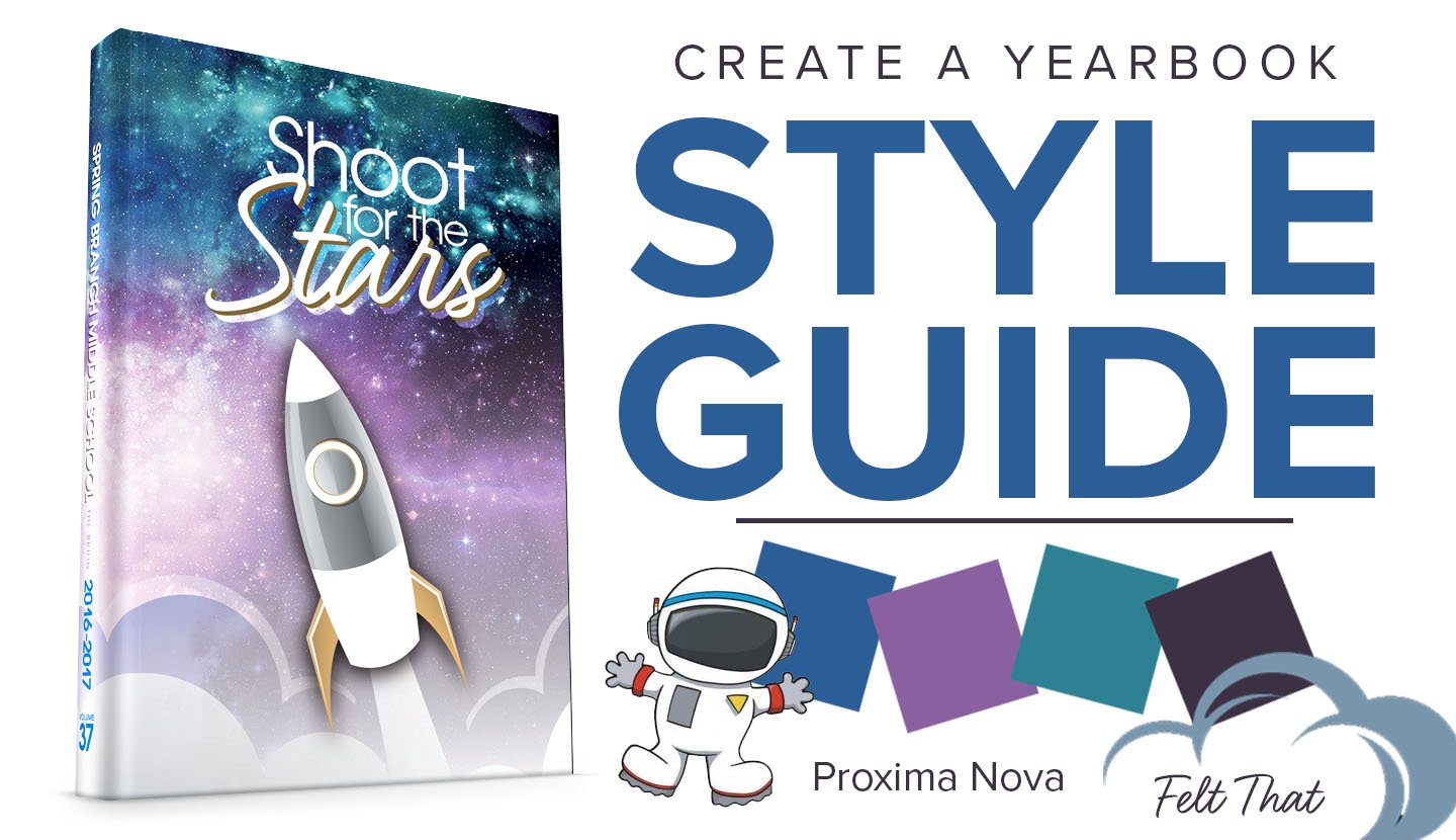
As you start visualizing the look and feel of your yearbook pages, the abundance of available design choices can be fun but overwhelming. This is where creating a style guide helps. So what is a style guide and how do you create it?
A style guide helps to create a consistent look and feel for your yearbook. It positively impacts the design process by limiting the number of available choices when it comes to fonts, colors and other graphic elements. Your style guide can also touch on headline and writing styles to keep a consistent tone. Picking the right elements to put in your style guide is important, and here are the steps to creating a style that will set your yearbook apart and speed up the design process.
1. What’s your tone?
The tone of your yearbook will determine the style. What feeling does the cover design and theme phrase hope to evoke in your readers? Is it warm and traditional? Bright and funky? School spirit? Retro? Grunge? Determining the tone will help guide you as you select fonts, colors and graphics so this step is important.
2. Decide on fonts
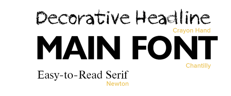
Balfour offers a wide array of font options, but it’s best to limit your fonts to a small collection of three. Pick an easy-to-read font for text and student names, pick a headline font for your main text, and mix in a fun, decorative font to add style.
3. Pick a color palette
Less is more when it comes to colors, too. Use your color palettes to complement the tone of your yearbook. Consider starting with your school colors as a base or pick a fresh palette to match your theme. Check out this fun site to help generate color schemes.
4. Choose headline styles to hook readers
How will you present the topic of each page or spread to your reader? Most yearbooks have titles or headlines to quickly tell the readers what to expect. Get creative by creating a catchy headline while mixing together your font styles and colors determined in the previous steps.
5. Consider design elements
Based on the tone and theme of your yearbook, what graphic elements, if any, will you include? Less is always more when it comes to clipart and backgrounds, so consider a subtle way to use graphics to tie your book together. If you are using clipart, limit your gallery to a just a few pieces and reuse them in different colors.
Keep track of all your selections on this handy style guide sheet.
