

Pictures, copy and Goldfish? Design takes a delicious detour when we teach the elements of yearbook design using food. With a few pantry items, we can turn basic design principles into a tasty lesson. So, grab some Goldfish and M&Ms. Captions have never tasted better.
Pictures, copy, and white space can be overly simple terms that don’t always translate into the bigger picture of yearbook design. Whether you have yearbook novices or returners who need a refresher, all staffers need an understanding of basic design. To make the lesson more interesting (and appetizing), we’re sharing two former advisers go-to teaching method, former Allen High School adviser Kelly Juntunen and former Seven Lakes High School adviser Katie Moreno.
Preparation & supplies
You’ll need a few items to create this design lesson.
- Graham crackers
- Chicken in a Biskit crackers (if unavailable, saltine crackers or Cheez-its are a good substitute)
- Goldfish
- M&Ms
- Twizzlers
- Jelly beans (optional)
- Paper cups
- Layout sheets
Getting started
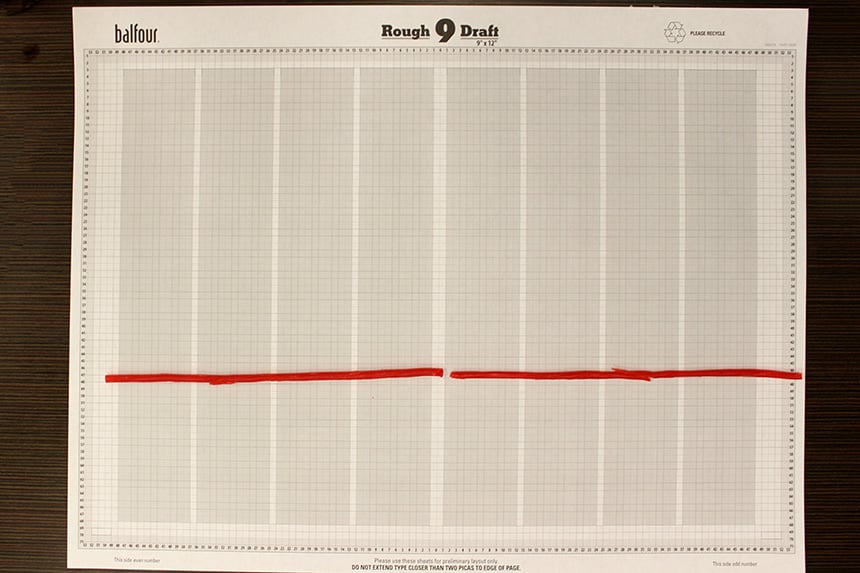
First, give each student a rough layout sheet (available to order in StudioBalfour). Use the sheet to explain the basics of a yearbook spread, including columns, picas, gutters and margins. Kelly’s Delicious Design show or the Basic Design show in the Education section of StudioBalfour are both good options to guide this process.
This is also a good time to review the basic elements of design—photos, words, and white space. Principles like the difference between a dominant photo and a secondary photo, the importance of white space, how each element should be a pica apart, and that design elements should start and stop on a column can be taught here.
Design key
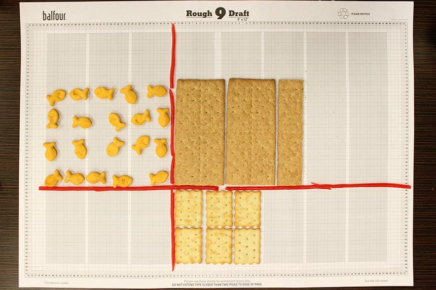
With this overview, students are ready to start eating—ahem, we mean, designing. They’ll use the different food items to represent the elements of the spread. Here’s a Design Key to help you:
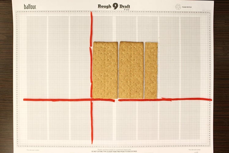
Dominant photo = Graham crackers
Secondary photos = Chicken in a Biskit crackers
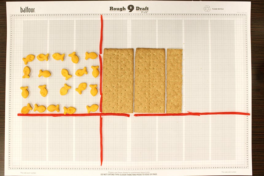
Headline & Copy = Goldfish
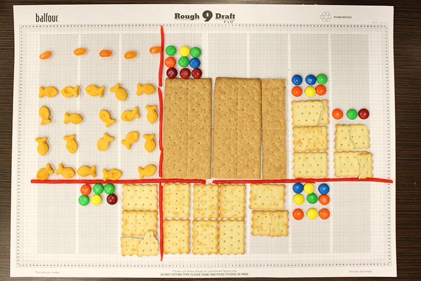
Captions = M&Ms
Eyeline = Twizzlers
Design rules
1. Create an eyeline. Have each student place Twizzlers horizontally across the page as an eyeline. Remember the eyeline should be in the top or bottom third of the page and never in the center. For this initial design lesson, we recommend you have students create this exact spread, using the lower third of the spread to create the horizontal eyeline. You can always do variations of the design after they learn the basics.
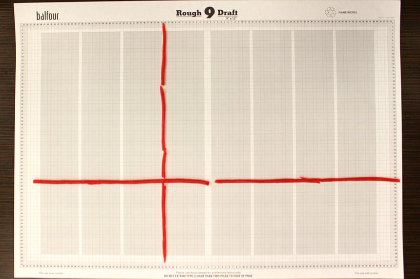
2. Add a vertical axis. Still using the Twizzlers, have students add the vertical axis between two columns on the left page of the spread. Explain the intersection of the pieces of licorice represents the axis point and all elements of the design should extend from this “center."
3. Draw a dominant photo. Have students identify the largest quadrant of their spread. They’ll place the graham crackers down adjacent to the vertical axis and horizontal eyeline to represent the dominant photo. Keeping to the rule of starting and ending design elements on a column, students may have to break the crackers to fit the desired area for the dominant photo. But remember nothing has to be perfect, it is a cracker after all.
4. Place the story and headline across from the dominant photo. After the dominant photo comes the body copy and headline. The goldfish crackers will represent the body copy, headline and subheadline. If preferred, students could use jelly beans to represent the headline to differentiate the two types of copy. Remind staffers the headline and copy typically go in the second largest quadrant and should be near the dominant photo.
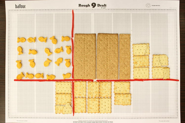
5. Add a smaller, secondary photo. Using the Chicken in a Biskit crackers, students should add the smaller, secondary photos. The first image will start at the vertical axis, go across the gutter and reach the bottom external margin. This is a good time to reference the bulls-eye effect, which places the heavier elements, like photos, toward the axis point and middle of spread. Photos are followed by copy and then white space around the edges.
Students may stress if crackers are accidentally broken while trying to “fit” the picture. Thankfully, eating the broken image/cracker is a good fix.
6. Add additional secondary photos. Using various shapes and sizes, fill in the rest of the spread with additional photos. Remember to start at the eyeline and go to the ends of a column. (Don’t forget to remind them they should not place photos across the eyeline; images should start at the eyeline and go up or down.) Encourage students to resist the urge to make pictures reach every corner of the spread. White space is a good thing.
7. Place the captions. With crackers/pictures in place, add captions using the M&Ms. Remind staffers there should be a caption for each picture and that it should be next to the image, possibly above or below, or to the left or right. (This is a good opportunity to show students they should not “trap” captions between photos; copy should be placed on the outsides of images. Another caption guideline students should be aware of: captions should be the same width (in this case, one column wide), but they can be different lengths. This gives a little versatility when there are more names to include or a longer quote.
Evaluation
After all the food is in place, have students take a step back and look at their design. They can pull off the licorice and eat it first as a reminder these lines are just to guide the design process. This is also a great time to take a picture of their handiwork for grading and sharing on social media. (You’d be surprised how many other students will be interested in yearbook after seeing the photos!)
Before they eat the rest, have staffers evaluate their own or a neighbor’s design (this is also a bonus chance for an additional grade). Here are a few questions to ask as they evaluate:
1. Is there 1 pica between every element?
2. Do you have an eyeline that spans the page?
3. Have you achieved the bulls-eye effect?
4. Does every photo have a caption?
5. Have you avoided trapped captions?
6. Does your design allow for white space or does every element extend to the end of the page?
7. Does each element start and end on a column?
8. Is the dominant photo two to three times larger than the next largest photo?
A regular basic design lesson would stop with the critique, but this one ends with a delicious feast of photos, captions and copy. Whether to introduce new students to a basic yearbook layout or start the year off with a fun reminder, this delicious design lesson can be used in any classroom. So, grab some Goldfish and M&Ms. Captions have never tasted better.
