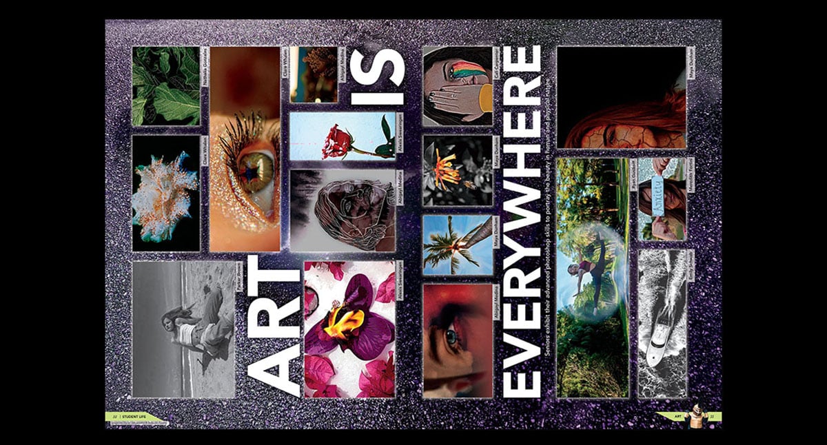
The sideways spread was an interesting trend in 2019 yearbooks. Let’s look at seven books that took yearbook design to a whole new perspective.
Editor’s note: This was a post originally planned for this spring, but it was held after the pandemic shifted yearbook needs and priorities. We thought it’d be nice to showcase this cool design trend.
It’s not your typical yearbook spread. But a sideways spread can have its advantages. For one, the juxtaposition can surprise readers (which is a good thing when they’ve seen the same layout over and over). It’s also a creative challenge. And it’s an opportunity to present content in a fresh manner.
Professional magazines employ the sideways strategy when the content dictates it’s necessary. Seattle Met utilized the turned look for a stunning spread on cold treats. A vertical photo of a solar-powered surfboat caused Inc. magazine to turn their spread sideways, allowing for additional infographic and details to be placed around the image that wouldn’t have worked with a traditional layout.
Let’s look at how seven schools utilized the sideways spread for a unique frame of reference.
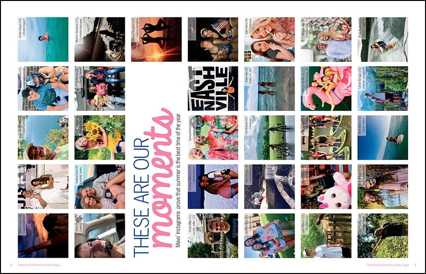
Anderson County High School, Clinton, Tennessee
This school, using StudioWorks+, utilized a sideways spread early in this chronological book. Using Instagram photos, the staff featured student life coverage of summer fun and travel. The headline, also connects to the “Maverick Moments” theme.
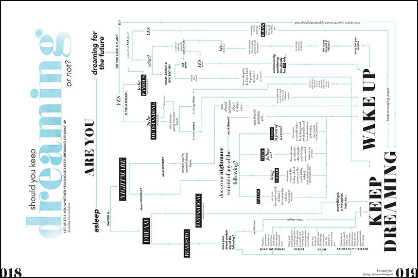
Bowie High School, Austin, Texas
The Bowie staff expanded on their “reverie” theme with several spreads focused on sleep and dreams. This interactive spread benefits from the turned format, giving the elaborate flow chart the vertical space it needs.
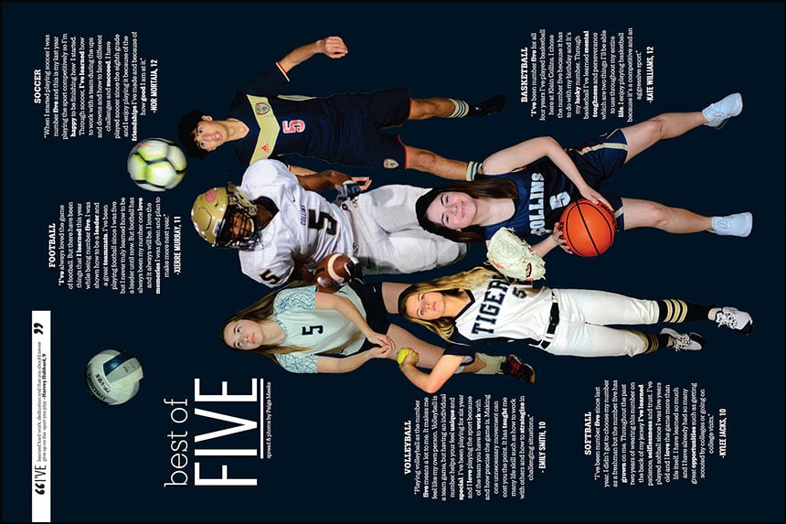
Klein Collins High School, Spring, Texas
A dark background creates a dramatic backdrop for this sports spotlight from Klein Collins. The sideways spread allows the designer to layer the cutouts and utilize centered blocks of text.
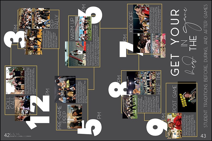
Little Rock Central High School, Little Rock, Arkansas
For their “Central Hoorah” theme, The Pix staff featured two sideways spreads. One focused on the student population in seven different decades while the other was a timeline of game day traditions. Both employed a charcoal gray background, bold numbers and a yellow graphic line to lead you through the content.
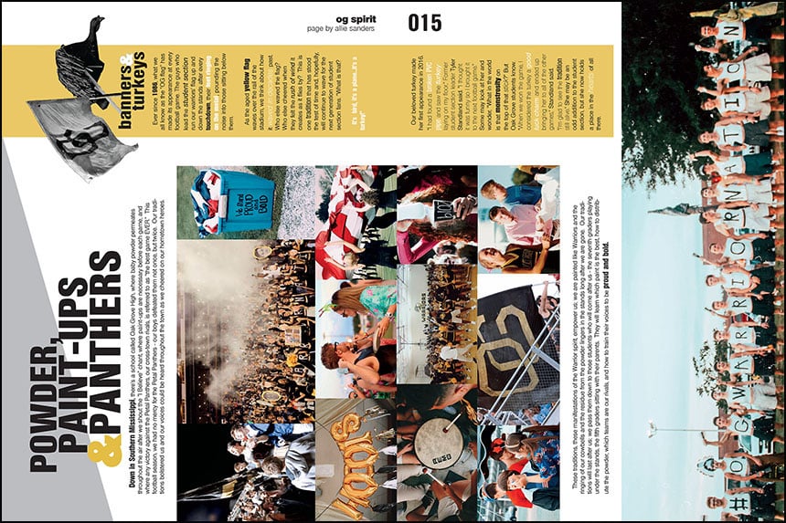
Oak Grove High School, Hattiesburg, Mississippi
In their student life section, The Warrior staff turned the spirit spread on its side. The switch gave the designer ample room to run a wide photo of 16 fans across the spread. Similarly, the sideways design resulted in a longer than usual sidebar, providing more content.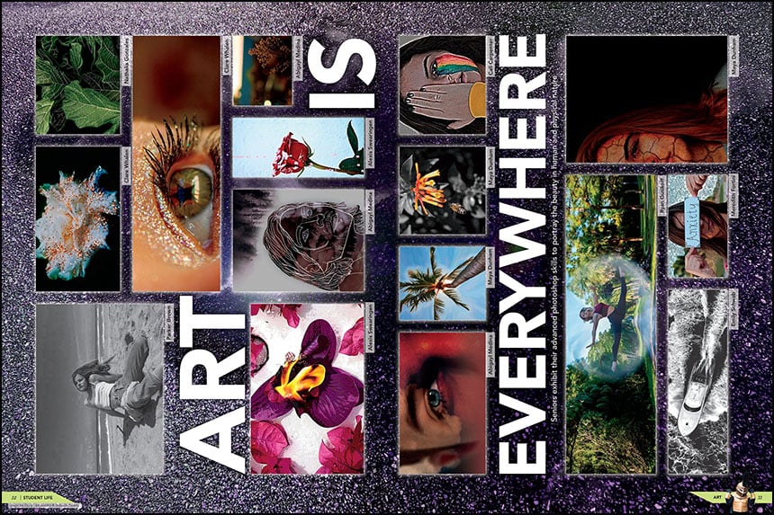
Suncoast High School, Riviera Beach, Florida
The sideways look gave the Suncoast staff a fresh approach to their art spread. The switched format allowed the designer to feature unusually wide photographs in a pleasing configuration.
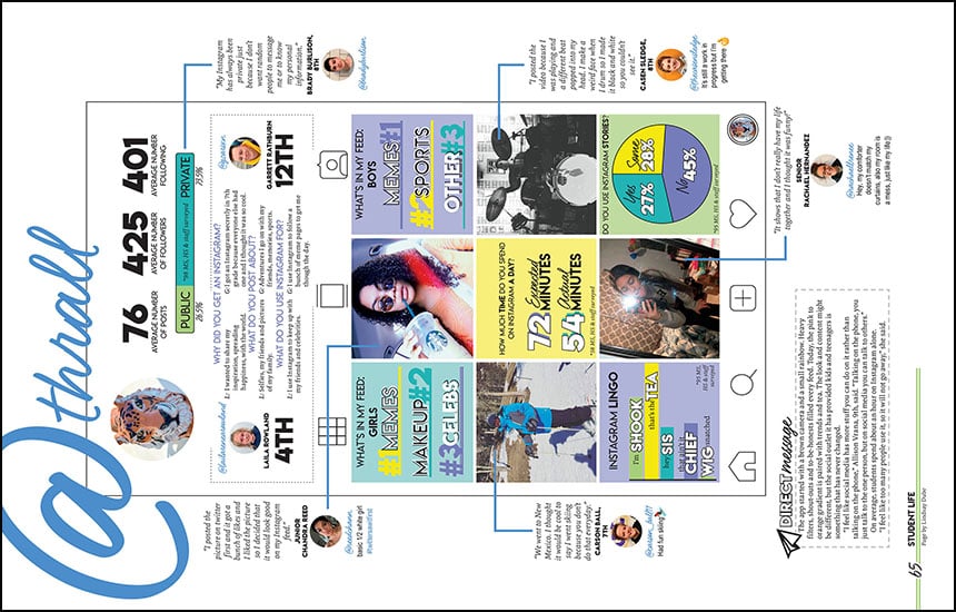
Thrall High School, Thrall, Texas
In their student life section, this K-12 book took flipped the page 90 degrees for their social media coverage. The change let the staff use multiple graphics and quotes at a depth that wouldn’t have been possible otherwise.
