It’s unavoidable. The index is the most text heavy section of the yearbook. But you can make this necessary reader service a little more fun with pops of color, theme and people.
The index is an essential aspect of the yearbook, providing a historical record of all the people, clubs, sports and events covered in the book. It’s a vital reference tool that will assist readers for years to come. But it can be quite dull in terms of design. By adding a little fun to the pages, we can make the index more enticing for readers.
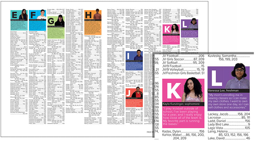
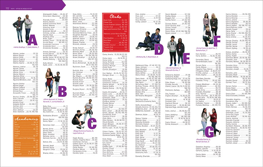
The easiest way to do this is by getting creative with the division letters. The simplest option is to use the theme’s font in a large size and match the color and look of the book. Staffs also opt to go further, adding quotes, cutouts, or both to their division letters. The benefits are two-fold: you’re connecting to the theme and adding more students to the book.
Connect to your theme
The theme is often an afterthought once you get to the reference section of the yearbook. But it’s important to carry the theme throughout the book, not just on the content pages. By incorporating the theme into the division letters, you’re continuing the concept visually on the final pages.
In the 2018 yearbook, the McCallum High School staff used a bright, color blocking scheme throughout the book. It was featured on the cover with cutouts of students. Their endsheets continued the look, adding quotes from the chosen students. The staff smartly used that same look in the index, featuring a different color block for each letter and adding a cutout and quote from a student. The bold look is a visual connection to the theme and a burst of color to break up the lengths of black text.
To go with their “Building the Beast” theme, Bellevue East High School also got inventive with their division letters in 2019. Playing off the construction theme, the used caution tape to form each letter. In addition, the staff posed students with different construction materials: an orange safety cone, a hammer, a screwdriver. No one would doubt these index pages came from the 2019 Bellevue East yearbook.
Add more students in the book
The other benefit to creative division letters is the ability to add more people in the book. This is an ample opportunity to squeeze in a few more students, especially those underserved. Have an editor look at your order list and find any buyers who aren’t in the book or only have been included once or twice. Those students should be your priority.
Snap a picture and incorporate it into your index division letters. If space permits, consider including a quote that connects to your theme. For example, if you’re doing a vision-related theme, the quote could reflect back on a funny moment from the year. Or it could look forward 10 years, “envisioning” the future.
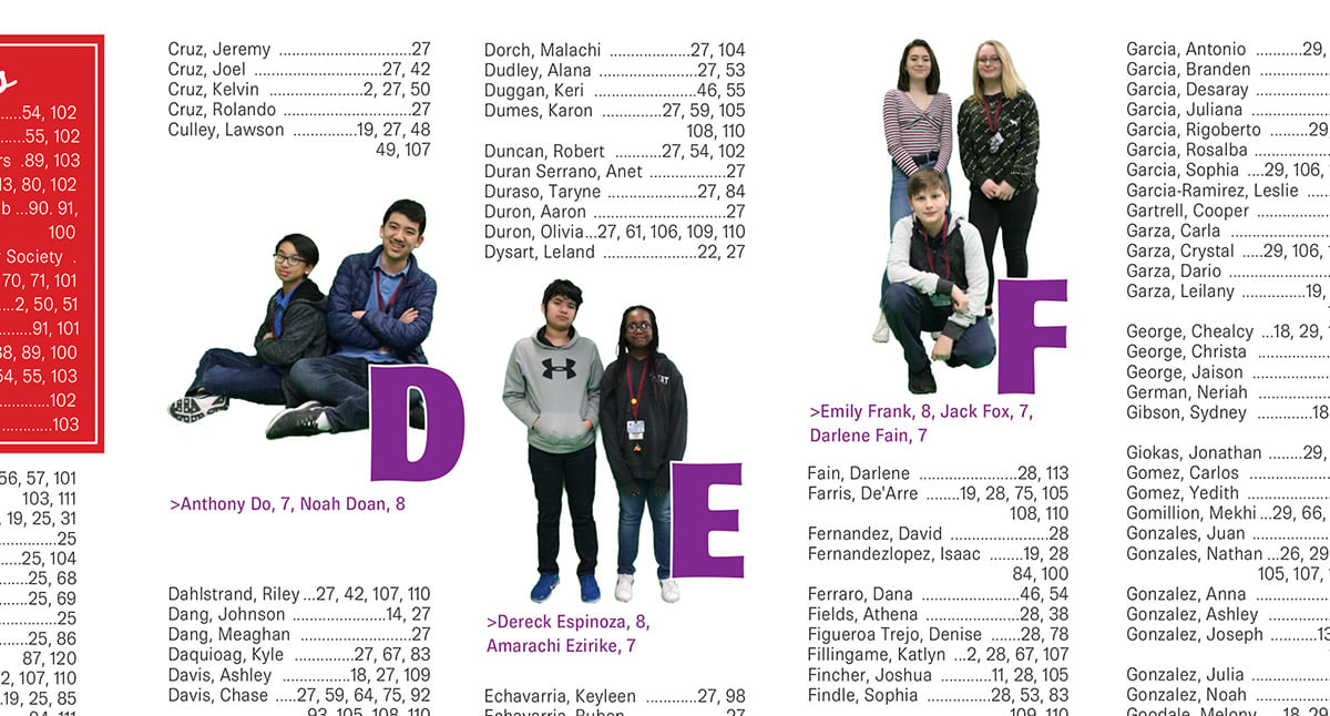
Pearland Junior High West utilized students in their index in the 2019 yearbook, adding cutouts of people with each letter. But instead of choosing just one student to represent the division letter, they featured two or three. Instead of getting 26 more people in the book, the staff more than doubled the numbers, adding 55 students in the book.
Don’t let your index be an afterthought or just rows of tiny text. Sprinkle in some fun and students with creative index division letters.
