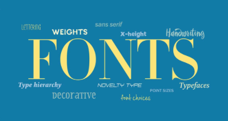
Slim and sleek? Bold and brash? Quirky with a kick? Choosing fonts has everything to do with the look and feel of your theme.
First, it’s important to understand the different font types and when to use them.

Serif: This font type originates from ancient Roman carvings. Serifs are small marks or “feet” at the end of each letterform. These fonts work best for large blocks of copy, such as feature stories.
San-Serif: With no serif at the end of the letterforms (san literally means without in French), these typefaces usually have no visible thin or thick transitions. These fonts work best for headlines, subheads and captions.
Slab Serif: Similar to the serif but with a heavier weight, usually rectangular in shape. Slab serifs have little to no thin or thick transitions. These fonts work best for headlines.
Script: Script typefaces emulate cursive writing and hand-lettered type resembling the look of a calligraphy pen or brush. These fonts work best for accents and headlines.
Decorative: Also called novelty or display type, these typefaces are fun and distinctive. The styles have an artistic flair with personality. These fonts work best for headlines or large call-out text. Warning: Use this type of font sparingly.
While it is not necessary to choose one font from each category above, certain styles pair best with one another. For instance, a light and airy script pairs well with a thin san-serif. Avoid choosing two of the same styles of fonts, such as two serifs or two san-serifs. You may even find a single font family with enough weights and contrast to do the job of all the fonts in your yearbook. For more on fonts, check out this great guide to typography.
Set the tone by selecting a typeface that showcases your theme’s personality. A classic theme might lend itself to serif and modern serif type. A slab serif type would be a great way to visualize a bold theme.
Familiarize yourself with type options by going through the Balfour Font Guide. The guide features more than 300 typefaces, separated into four type categories: serif, sans & slab serifs, handwriting and decorative type. The guide features all 26 letters of each typeface as well as examples of the font in sentences and sample headlines. The back of the guide has an education section to provide additional knowledge on type classifications, weights and spacing.

And if you haven’t heard, there are 16 new typefaces added to the Balfour font family. Here’s a listing of the fonts and some suggested pairings with some of your favorite oldies.

