
As part of a series for elementary school advisers, we’ll focus on topics that concern K-5 yearbooks.
The idea behind Baskin Robbins sounds delicious in theory: 31 flavors to choose from. But a multitude of choices can overwhelm: which one should I pick? What if the strawberry is better than mint chocolate chip? The same type of choice anxiety happens with yearbook design.
There are hundreds of templates, backgrounds, colors and fonts to choose from. It’s the Baskin Robbins dilemma multiplied by a hundred different toppings and goodies. When it comes to ice cream flavors or yearbook backgrounds, less is more.
Between the SimplyCreate collection and stand-alone backgrounds, there are more than 500 options to choose from. But a plethora of choices doesn’t mean we should choose a different look on each spread. Instead, stick to one look that you can carry throughout the book. For example, the starsSTRIPES theme has five different backgrounds, all that incorporate stars or the colors red, white and blue. Using only these backgrounds throughout the book provides a cohesive look that ties the book together.
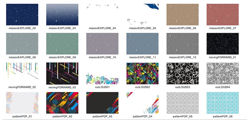
A sampling of SimplyCreate backgrounds shows each theme has several options that visually connect to the graphic look. When choosing backgrounds, strive to use similar ones to provide a consistent look throughout the book.
Also, consider using backgrounds sparingly. Elementary pages often have collages and multiple, small pictures. A busy background with graphics and colors can distract from the content. Ask yourself: do I want readers looking at the background or the photos? If you feel a background adds to the page design, strive to use one with subtle touches, lighter colors or a screened, muted look. This will allow for some pizazz on the page without taking away from the images.
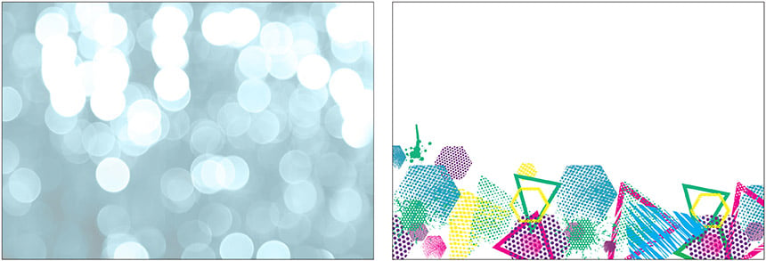
Backgrounds with muted, screened backgrounds or just pops of color and graphics are smart choices. This allows more of the focus to remain on the photos being added to the spread.
Narrowing the choices might be difficult at first. But streamlining the look of the book will provide consistency and clarity for the reader. And that’s as sweet as strawberry ice cream.
