As part of a series for elementary school advisers, we’ll focus on topics that concern K-5 yearbooks.
A fun part of producing an elementary school yearbook is the opportunity to highlight student work. The cover is a premiere spot to celebrate artistic talent as well as showcase school spirit and encourage student involvement. It only takes a few crayons, markers or paint brushes.
Featuring student work on the cover is a great way to create a first impression. It provides a fun touch that works well for a publication geared toward a younger audience. The process can be opened up to all students or limited to older grades, possibly the fifth grade classes only. Most schools create a contest, with an art teacher or PTA volunteer coordinating the process.
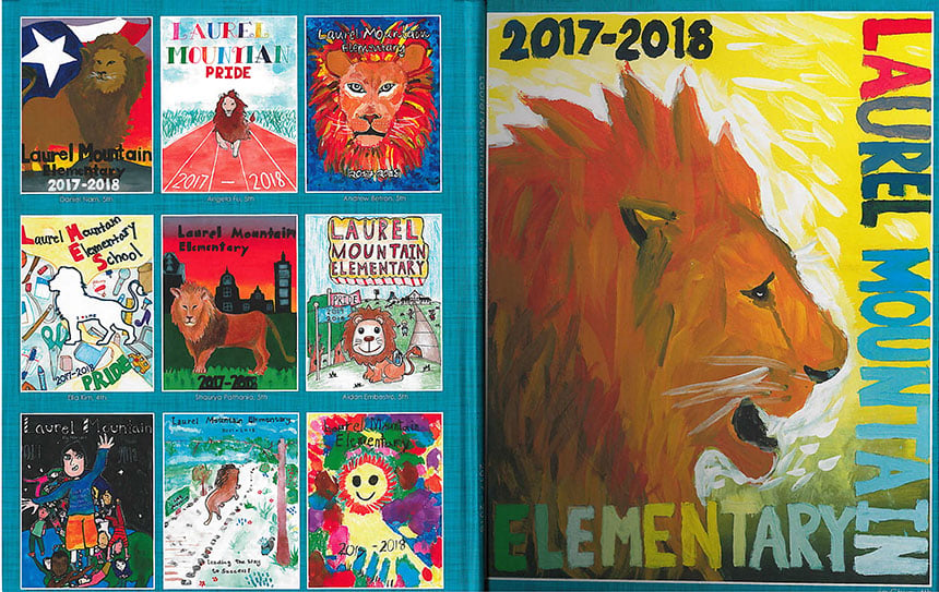
Laurel Mountain Elementary, 2018
If you’re thinking of using an illustrated cover in the future, consider these suggestions:
- Provide paper so all images are a size that will work with the cover proportions. Give the winning entries to your Balfour representative who will have them scanned at the plant.
- Give contestants instructions and set criteria for what to draw. A prescribed topic will help to create a unified look and tone. Consider focusing on the mascot, an anniversary, an event, the school building, the surrounding community or a prominent event (solar eclipse, Olympics, etc.). The result? An impressive first impression.
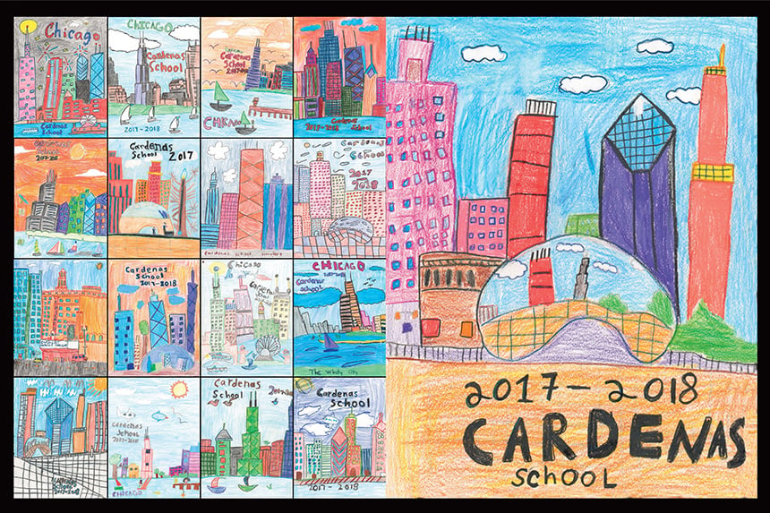
Cardenas School, 2018
- Ask students to put their name, teacher and grade on the back of the art. On the cover, add students’ names below the art in a simple, clean font.
- If the school name or other words are part of the cover illustration, make sure they are spelled correctly. (Provide spellings with the instructions.)
- Have a yearbook committee, a group of teachers, or the student body vote for their 10 favorites. Then select a first-place winner.
- Consider giving the winner a free yearbook. This will generate excitement for the contest and the yearbook.
- Include all the runner-ups on the back cover, a smart way to feature more student art and showcase different interpretations of the assignment.
- By running student covers on the title page, you will include even more students’ work, and hopefully, sell more books.
- Consider running multiple pieces of art instead of one image on the cover. In 2018, Hunt Elementary featured multiple heart illustrations to go with its “Love them Hounds” theme. Every year, Highland Village Elementary has fifth graders color a shape. Then the shapes are pieced together to create a cover image. This annual tradition allows every fifth grader to have their work featured in their last yearbook. It gives them something to look forward to.
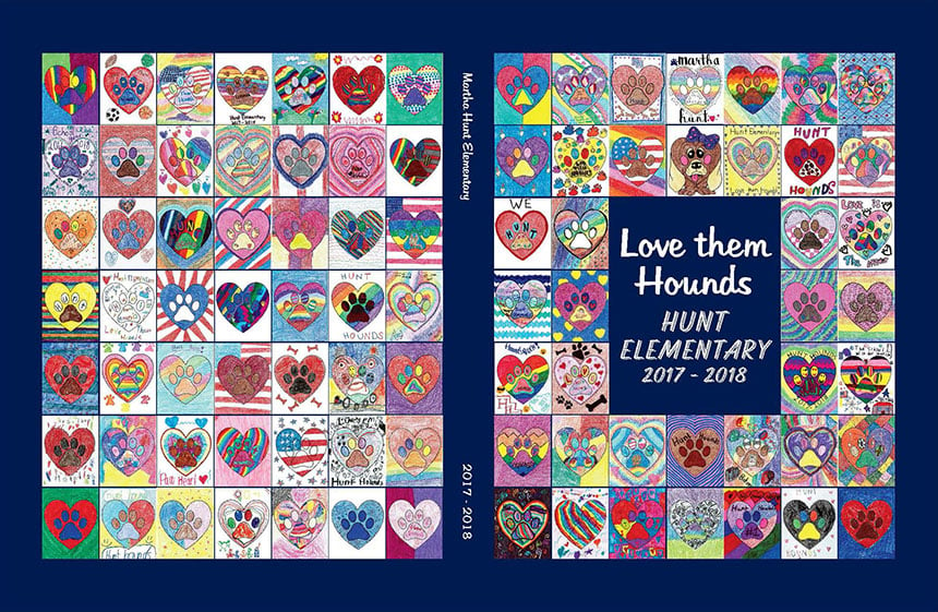
Hunt Elementary, 2018
Another cool aspect of the illustrated cover is how easily it can be prepared for publication. Plant personnel scan the art and create the cover in StudioWorks, or the artwork can also be incorporated into one of the SimplyCreate themes so it coordinates with the inside of the book. For their 2018 yearbook, Canyon Creek Elementary used seven student illustrations, one on the front lid and six on the back. The artwork was blended with a SimplyCreate cover that used hand-drawn doodles. Other SimplyCreate art, such as backgrounds and clip art, were used throughout the book.
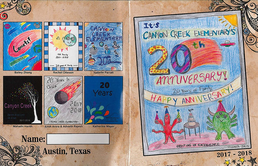
Canyon Creek Elementary, 2018
Using student artwork for the yearbook cover is a smart way to get students invested in the book. They’ll be more interested in buying a book if they participate in its creation. And it’s really fun to see student-created images splashed across the yearbook.
