Summer might be over, but we can relive it all year long with sizzling summer spreads. Let’s head back to the beach with 2022 books to find inspiration for new layouts.
Use modular design to showcase multiple stories
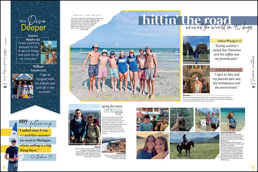
At Anderson High School, the staff opted for a traditional layout with a multitude of storytelling opportunities. The focus on summer vacations allowed The Afterthought staff to share stunning landscapes and fun stories from around the globe.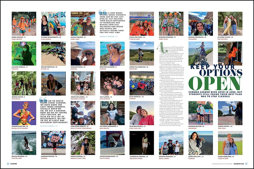
Maximize space
Claudia Taylor Johnson High School kept it simple, using Instagram-style photos to share the summer. With 33 images, two pull quotes and a feature story, the Citadel staff captured a vast array of student experiences.
Go for the wow factor
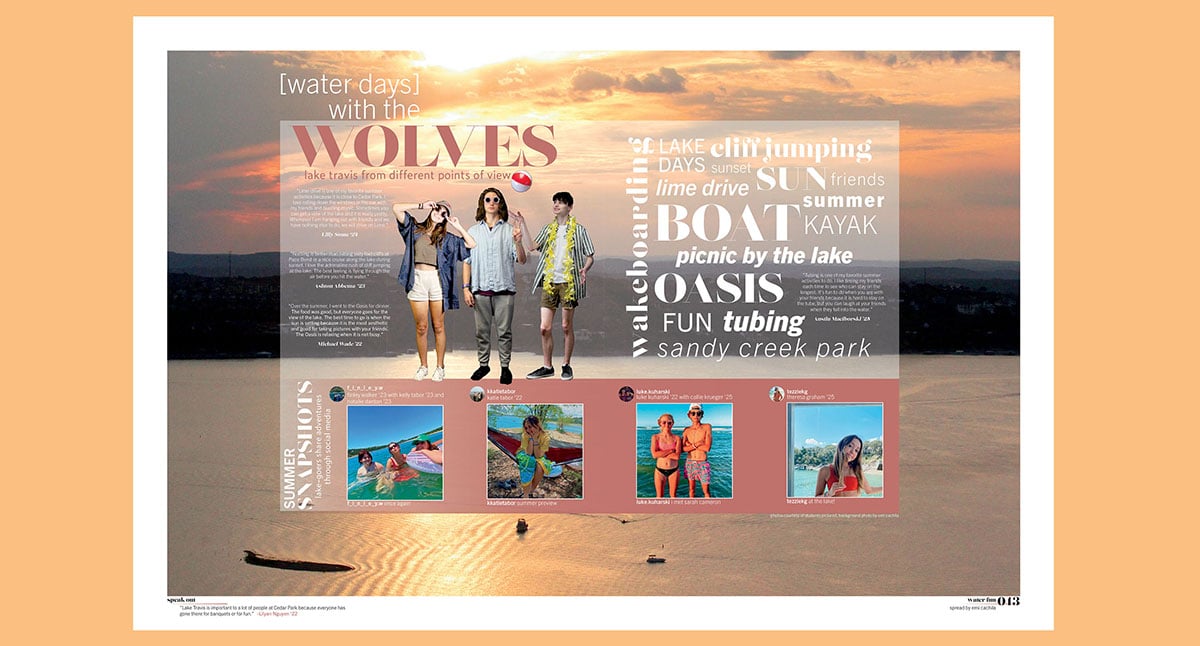
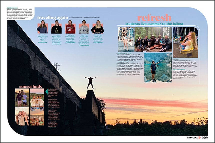
Glacier Peak High School placed a large sunset photo as the background for their summer coverage. The Edge staff smartly added additional coverage in empty spots for a smashing showstopper layout.
Feature more than travel
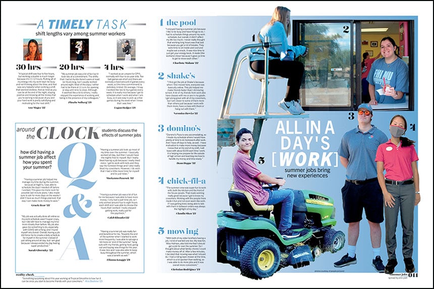
The Tracks staff dug into work schedules as part of their summer coverage (check out their cool lake spread at the top of the post). Including multiple Cedar Park High School students, the staff featured a variety of employment opportunities, work shifts and summer job reflections.
Show me all the pictures
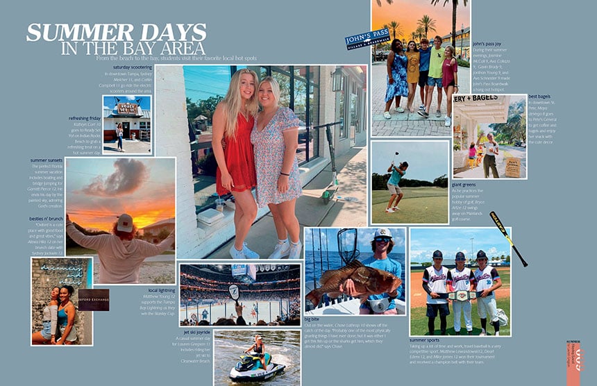
Matching the cover hue, The Crusader staff added a full bleed blue background to their summer design. Keswick Christian eschewed a story to focus primarily on photography, showcasing local hot spots. The extra negative space and organic layout make make this spread impressive.
Cover it all in one spread
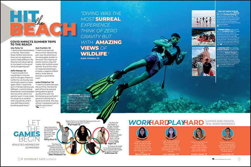
Short on space? The Heritage staff at Westwood High School combined summer travel, jobs and the Olympics into one spread. The scuba picture with the partially cut out fin is the finishing touch on a dynamic main package. Smart use of color and circles makes the two bottom modules eye-catching as well.
