
Get more bang for your buck with modular design. Modules provide more: more compelling design, more storytelling formats and more opportunities to feature students, classes, clubs and sports.
What is modular design?
Formally, it refers to set of standardized parts or independent units used to build a more complex structure. In the yearbook world, it’s an alternative to the traditional yearbook design (e.g. old school design of 5 to 7 images with a dominant photo, secondary photos and traditional captions). Borrowed from newspapers, yearbook staffs embraced the design concept and put their own twist on it. Essentially, yearbook modular design is a systematic way to place elements on a spread. It divides a spread into smaller parts called modules or mods.
Why use modular design?
Modular design is more back for your buck, spacewise. It’s more:
- Organized coverage
- Extensive, in-depth coverage
- Storytelling opportunities
- Photos
- Students in the book
- Multiple classes, clubs or sports
- Reader friendly
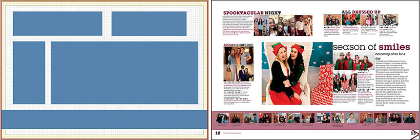 Minnetonka High School uses modular design in building their spreads in StudioWorks. In this holiday spread from 2018, they clearly blocked out spaces for each module, leaving three picas between each package.
Where do I start?
Divide the spread into several rectangles with ample space between each rectangle. Then, create modules to fit in each of those spaces. Modules are miniature versions of spreads. They use the same design concepts, but on a smaller scale. Modules should have:
- A strong headline
- Storytelling copy (captions, idents, quotes and/or story)
- Images or graphics
- Visual verbal theme connections (type, color & graphics)
- Tight inset spacing (micro spacing of 2-4 points to conserve space and show connection)
- A rail of white space between mods (macro spacing of 2-4 picas for separation)
The additional space between modules is an imperative aspect of modular design. It allows designers to create more in-depth, detailed modules without overwhelming the reader with too much stuff. Building additional space between modules allows the spread to breathe and lets the reader flow through the pages. If you’re using a grid system with columns and rows, you would leave one grid (also called a rail or separator) empty. If you’re employing a one-pica or small pica grid, you leave two to four picas of white space between the modules (we think three picas is a hearty—not too much, not too little—amount of space).
 This 2019 spread, from Holy Trinity Episcopal Academy, features four modules. The largest module anchors the spread with a clearly defined dominant photo and a large headline. The macro spacing between the modules provides needed white space and breathing room, allowing the eye time to rest and flow through the spread.
Ideally, one module package is the main focus of the spread, featuring a dominant photo and headline. It might also include smaller, secondary photos and some body copy, traditional or alternative. All the other modules, should be significantly smaller so they don’t compete with the main focus.
The modules should vary in formats and types, including but not limited to: mini-stories, mugs and quotes, photo bars, Q&As, timelines and poll results. (We’ll delve more into the types of modules in a later post.) Strive to vary your design so you’re not using the same module type two or three times on the spread.
Modular design provides your readers with more: more pictures, more compelling design, more opportunities to be in the book. Sometime, more is more.
