Photos aren’t the only way to illustrate spreads. We know the uncertainty of events, a lack of access and the virtual nature of schools have made photo collection tougher than usual. But that’s even more reason to focus on storytelling and feature typographical layouts. Here are a dozen designs to inspire your sans photo spreads.
Ironically, the trick to picture-less spreads is visual aesthetics. The design needs to be pleasing and beautiful to attract the reader. Without photographs, it’s the other types of visuals that need to take charge. Typography, graphics and color all play a role in how appealing the spread will be. Take a look at several examples to inspire your staff.
Quote-focused spreads
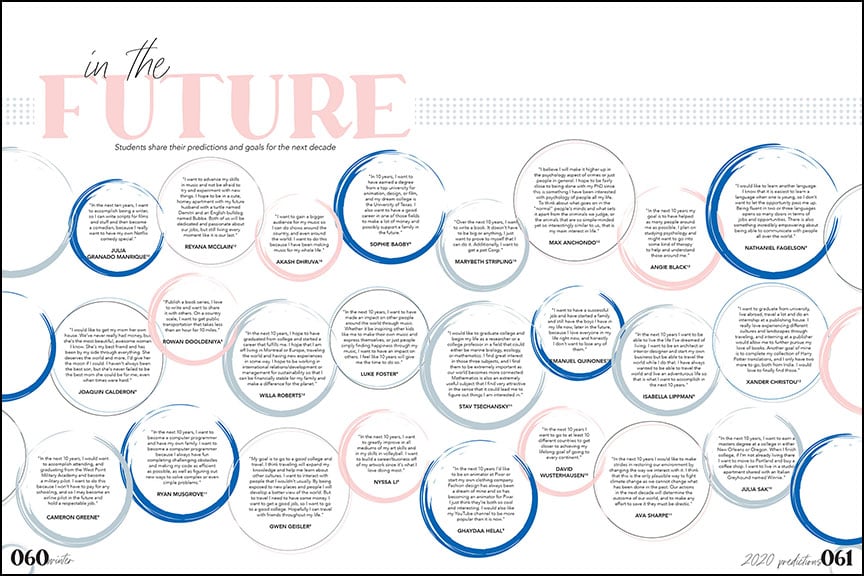
Bowie High School The Comet staff utilizes graphics, color and typography to create a dynamic, text-only spread. Their artistic circular graphic houses each quote while the placement, size and color variation provides a diverse, organic feel to the repeated design. The staff’s chosen fonts, in a substantial size, and the pink hue of the main word, give the headline visual prominence. The final touch of a dot pattern extending across the spread, adds additional visual interest and connects to the theme.
Glacier Peak High School This typographical layout from The Edge staff takes on a bold look with the use of color and defined spaces. It begins with the black background that creates a dramatic effect. The majority of quotes are placed on boxes of striking color: blue, gray and white. The typography, especially with the all caps headline look, also draws the reader in.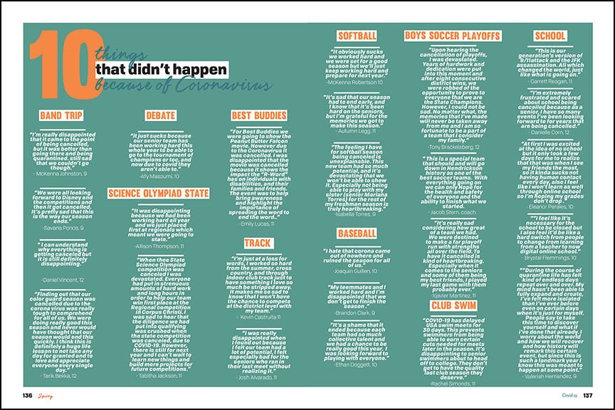
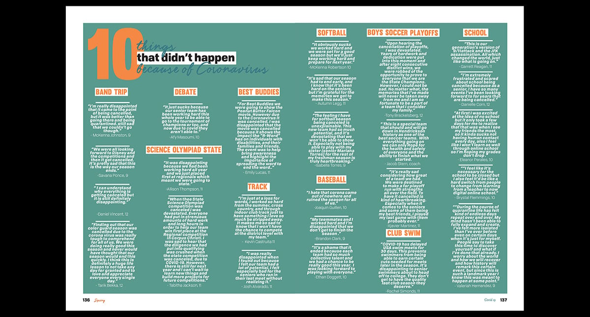
Hendrickson High School Not afraid of color, The Talon deftly applies vibrant hues throughout the 2020 yearbook. This text-only spread is all the better for it. The design choice to not bleed the color off the page accentuates the look, providing a sharp contrast between the blue-green color and the crisp white margins. The centered text also provides another unusual, but compelling design choice. Finally, the headline and subheadline labels provide visual entry points into this lovely design.
Interactive examples
Another popular typographical layout is the interactive one. Whether it’s a fill in the blank, quiz or flow chart, these spreads bring the reader into the page and content. They’re also a fine way to connect to your theme. 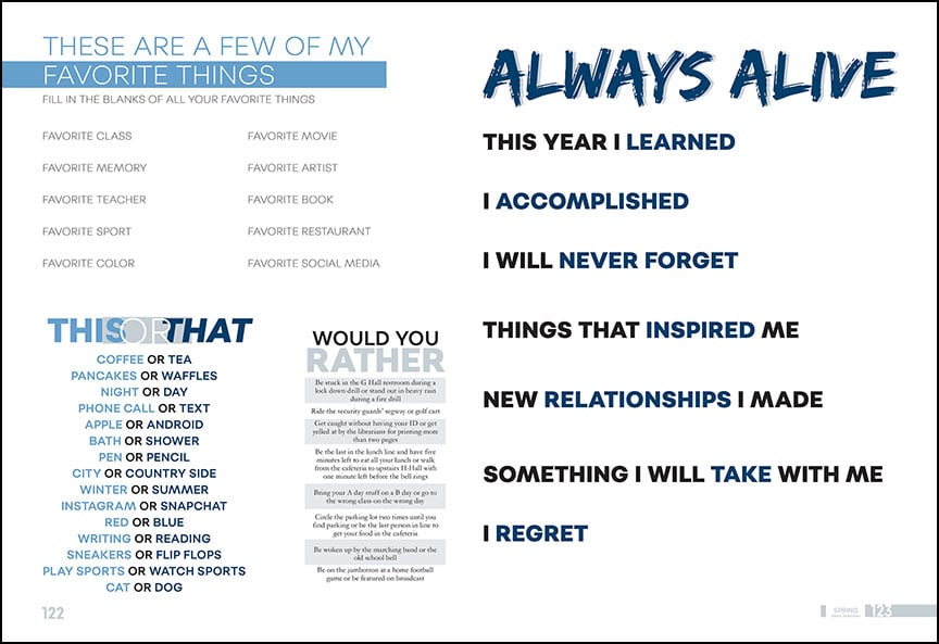
Allen High School This spread from the 2018 yearbook featured a fill-in-the-blank as the dominant package and several modules inviting readers to circle their answers. Bold typography and blue and gray hues provide interest and consistency with the visual design choices throughout the book. The primary headline also creates a verbal connection to the “Alive” theme. 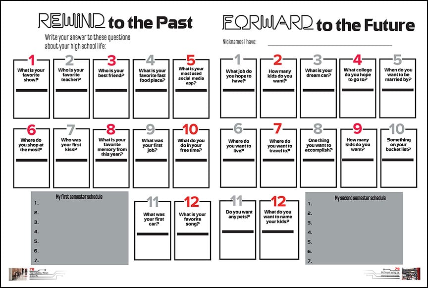
Fort Zumwalt South High School The Southpaw’s 2019 edition featured an interactive spread with striking visual and connections to their “Gen Z” theme. The typography, colors and graphics all mimic the visual look, while the topics relate to the verbal aspect. Numbered, outlined boxes and gray modules provide a symmetry that makes the spread easy to dig in to.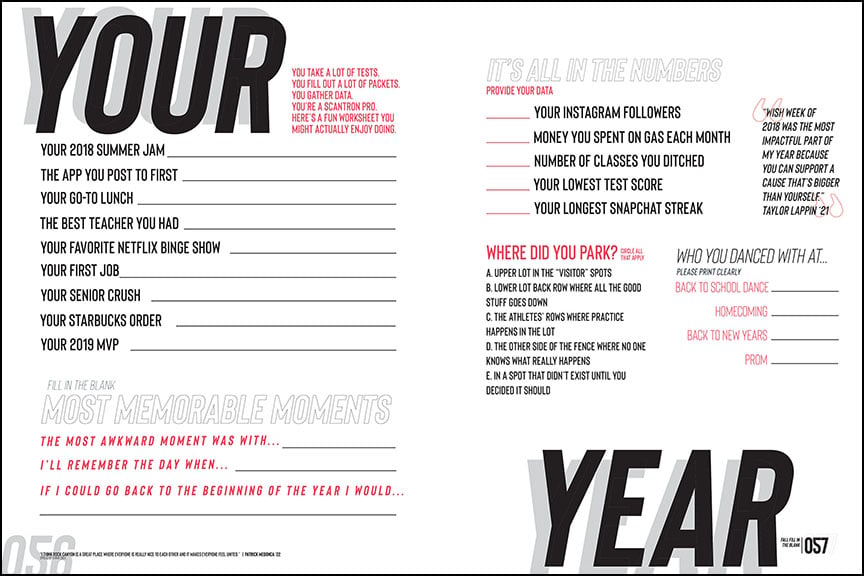
Rock Canyon High School The Black & Gold staff is known for their interactive coverage. The tradition continued in 2019 with two spreads, this one connecting on a personal level as well as on a theme angle. The “You United” theme is exemplified with the “Your Year” headline as it encourages buyers to answer pivotal questions about their experience in 2018-19. The use of caps, the divided headline and the pops of red work together to create a powerful interactive layout.
People spreads
Typographical designs aren’t limited to traditional double-page spreads. They’re a confident choice to break up blocks of portraits in the people section. The possibility of including 20-plus students also makes them an enticing option.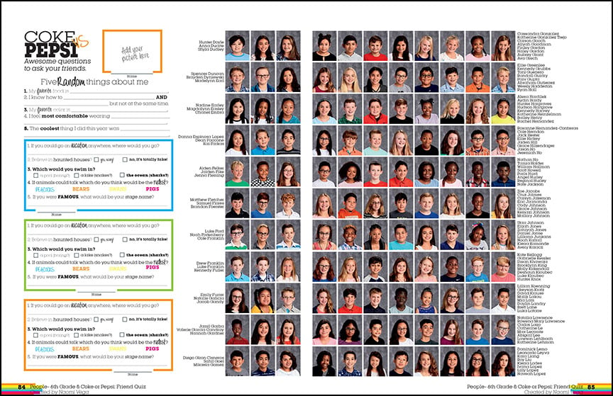
Ridgeview Middle School Interactive coverage works well in the people section. In this 2019 spread, the Panther staff employed students to answer questions about themselves and what-if scenarios. The pops of color and different font weights add to the fun design. Also, the place to add a picture is a cool touch.
Austin High School There is so much visual fun to this text-only module with the underclassmen portraits. First, The Comet staff utilized their circular art graphic for an attention-grabbing headline. But the real winner is the compact and strategic design of the copy. Using different point sizes, font weights and capitalization, each answer is strategically placed to create a compelling module. Mixed in with traditional black text, the pops of green, blue and pink color provide just the right amount of flair and fun.
Minnetonka High School Similar to Austin High School, the Voyageur staff also featured quote modules with their portraits. The text-only sidebar utilized the book’s two fonts in contrasting weights and sizes. Featured in both horizontal and vertical formats, the design also employed the jewel tone colors used throughout the book.
Graphic inspiration
When photographs are unavailable, substitute artwork for the visuals. Talented artists on staff could create hand-drawn illustrations or computer-generated ones. Don’t hesitate to reach out to the art department for contributions from teachers and students. Another option is to find free graphics online or purchase royalty-free illustrations. A graphic look to typographical layouts can add visual interest and the wow factor.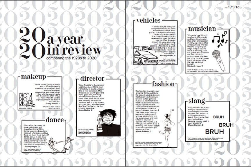
Leander High School The Lair staff infused drawings into this black and white pop culture spread. A staffer created all the drawings using her tablet. The artistic illustrations were a smart choice, especially for photos unavailable from the 1920s or from current national events, like the Oscars.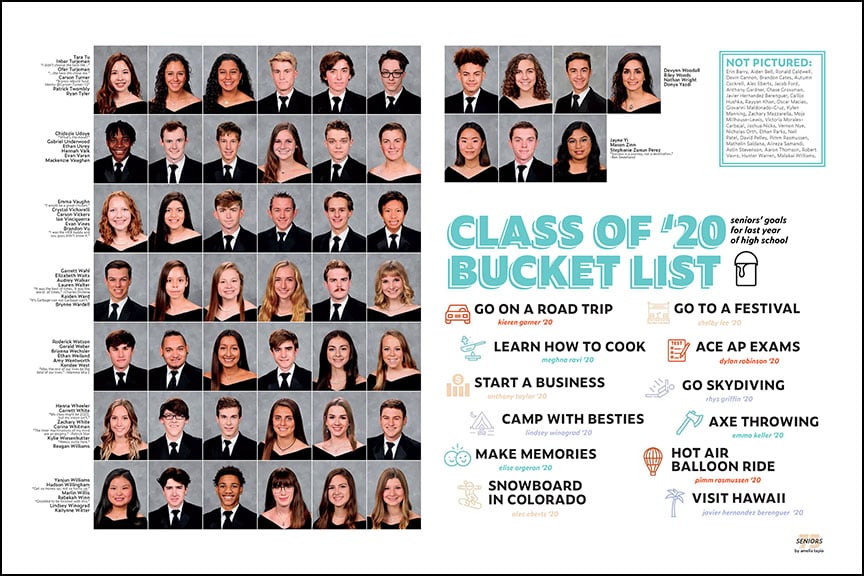
Cedar Park High School As part of their “Same But Different” theme, the Tracks staff incorporated flat icons into their visual look. They paid for a yearly subscription to Flaticon, choosing icons that visually expressed the copy. They also matched the icon’s color to the hues chosen for the theme.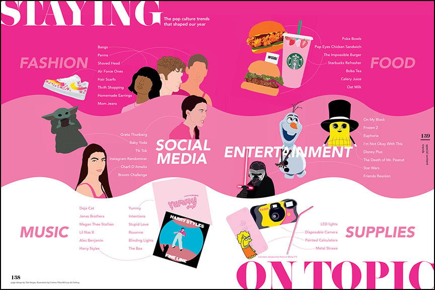
Suncoast High School One of the most vibrant uses of color and illustrations was this trends spread from the Renaissance staff. The bright colors set the fun tone while the illustrations add to the visual appeal. The staff transformed photos by coloring them in Photoshop and Procreate. The overall look creates a charismatic and entertaining design.
What will you create?
Spreads sans pictures might seem overwhelming or impossible at first. But a dozen examples from previous books show it can be done, and done well. We hope these typographical layouts inspire your staff to make their own text-only designs. We can’t wait to see what you design.
