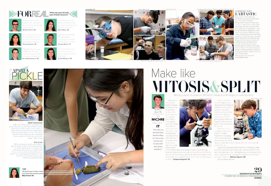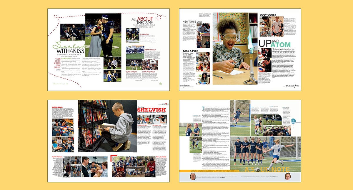
As the most significant verbal aspect of the design, headlines have a powerful impact on the look and feel of a yearbook spread. They provide a starting point for the reader, set the tone for the spread and create a visual/verbal connection to the main photo. Here are three tips to create headlines that pack a punch.
1. Write a powerful and catchy headline
Verbiage is instrumental in creating a headline that attracts readers. Using a label headline like “Student Council” or “Varsity Volleyball” isn’t going to entice students to dig into the story. The level of interest will increase with the level of language.
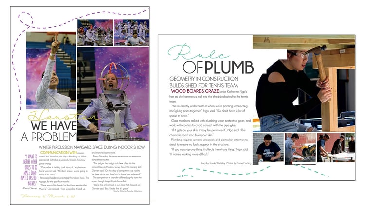
Alliteration, puns and other literary devices create verbal excitement. Rocky Heights Middle School employed onomatopoeia for a package about unusual pets, “Dif-fur-ent pets.” At Hendrickson High School, a spread about the winter drumline used the famous “Houston, we have a problem” allusion for a story about the team’s space-themed performance. A powerful or catchy phrase can grab the reader’s attention and draw them into the story. (Don’t forget to include a more informative secondary headline that summarizes the story.)
2. Create a strong visual/verbal connection
Having a catchy headline isn’t enough. The headline needs to have a strong visual/verbal connection to the dominant photo and story. Using “Block party” for volleyball is ambiguous; it doesn’t offer any insights into the story, dominant photo or spread. However, “Welcome to the block” would work well for a volleyball team moving into a new district.
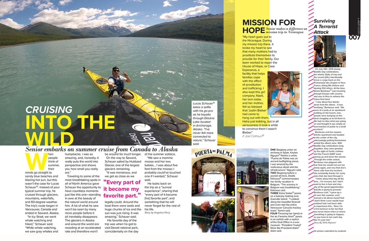
A community service spread in the Cistercian Preparatory School yearbook created a clever connection between the topic and headline. The headline “Don’t be shelvish” was paired with a photo of a student at a book shelf and mini-stories about volunteer activities. Similarly, a travel spread in Cinco Ranch High School’s yearbook created a strong visual/verbal connection. The headline “Cruising into the wild” provides a verbal reflection of a student kayaking and the story about his cruise from Vancouver to Alaska. The yellow headline color also added another visual/verbal link, emphasizing the bright hue of the kayak.
3. Design a headline with visual weight
Headline design plays a pivotal role in attracting the eye of the viewer. Running headlines in a straight line across the page can become mundane, especially if that is the only style used throughout the book. Consider layering headlines in multiple text boxes and on separate lines to bring more visual weight to the design. Using additional text boxes also makes it easier to change the size, weight or type of font used. Using a different font to highlight a word or adding multiple weights of the same font (book, bold, italic) can create visual interest and bring more attention to the headline.
Another way to provide contrast is to mix uppercase and lowercase letters. We recommend choosing a few words to change the case as opposed to running the entire headline all in caps or all in lowercase. Add visual interest by mixing type sizes in the headline, emphasizing certain words and de-emphasizing others. Typically, make less important words smaller and essential words larger. Another option is to add color to the headline or to the more important words. These types of layered headlines provide more visual interest and improve the readability and aesthetics of the spread.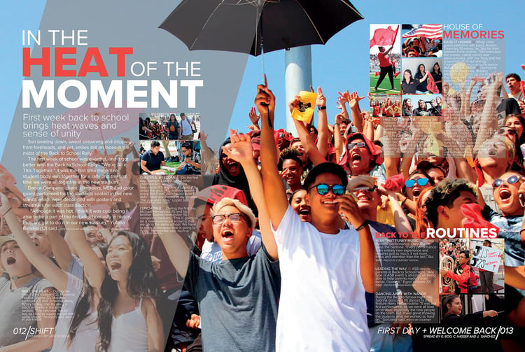
One last note on headline design: don’t be afraid to use any or all of these suggestions. Using only one or two headline styles throughout the book can create monotony. Provided you still use the theme’s fonts and colors, we recommend having fun with your headlines. Mix and match sizes, weights and case styles. Play with different lines of text and color. Be clever with your use of wordplay. This will create visual interest in the spread and lend spontaneity to the design. Consistent font and color usage will keep continuity through the book, but these tips will give the headlines more weight, to pack a punch. Knock ’em out!
