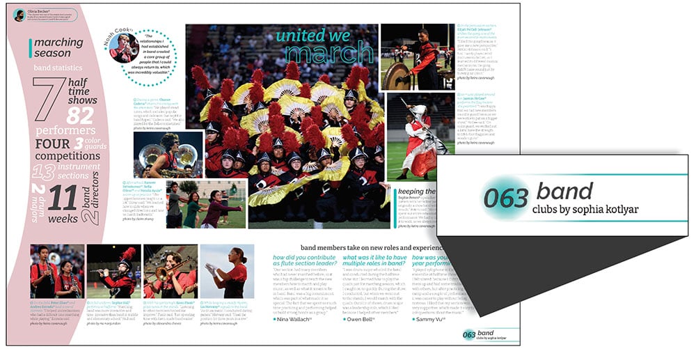
As part of our series, “The Essentials,” we present the required elements of yearbook. Today’s focus is the folio.
The folio is an essential reader service, providing vital information to the audience. Its primary function is to feature the page numbers, placed at the bottom, sides or top corners of a spread. While the placement varies, folios are located in the external margin area of the spread, outside the design area and near the page edge.
Often, the folio includes a topic identification (band, varsity football, pep rallies, etc.) and/or the section (fall, organizations, reference, etc.). This provides readers with additional information to easily identify what is being covered on the spread and what section the page or layout is in.
The folio area is also a popular place to add design or story credits or include theme-related visuals. The page numbers are typically placed in the chosen fonts. Also, a small visual accompanying the page number is a simple way to carry the theme throughout the yearbook.
 The Bellaire High School yearbook staff opted to feature their folio only on the right page, including the page number, topic, section and designer. The use of color and circle graphic connected with the 2022 theme.
Where will you run your folios?
If you’ve always included folios in the same place, consider a different spot this year. Maybe down the side of the page is an innovative choice. Perhaps you prefer to only feature page numbers on right-handed pages to allow extra content in the left folio area. Wherever you place them, know this is a reader service your buyers appreciate.

