
Introduce visual motifs that will be carried throughout the book on the cover
Try to introduce five visuals that may be carried onto theme pages—opening/closing and dividers. (The graphic strategies will also link elements of the section design to the theme.)
Make color choices
The colors introduced on the cover of the book match or complement the colors on the theme pages. This repetition of color as a visual indicator reinforces the theme presentation. Spot color in the rest of the book should also coordinate, not necessarily imitate, the colors on the cover.
Design a distinctive visual presentation for theme pages
Theme design offers graphic possibilities. Experiment with photo treatments, type placement, and graphic enhancements. REMEMBER to link the look of the opening and dividers to the cover and endsheets. The book must present a unified visual effect.
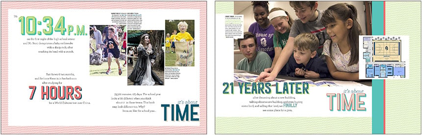
On two opening spreads, Hill Country Christian School showcases a distinctive look for the “It’s about time” theme: bold colors, a shadowed font and a hatch, diagonal line.
Consider different copy approaches for opening/dividers/closing:
Dialogue, lists, 1st-person, 2nd-person, 3rd person. Also, carefully select words that support the tone of the theme. Keep the copy format and tone consistent on opening, dividers and closing.
Be specific in opening and closing copy
Copy should cite examples of both individual and collective experiences: student/school/athletic/club recognition, campus renovations, unusual activities, noteworthy events, etc. In other words, time stamp the book with details. Don’t hesitate to include times, dates and names.
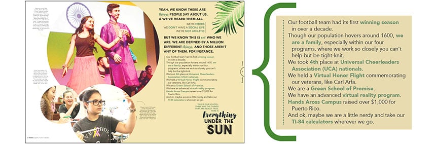
Suncoast High School’s opening copy includes specific examples from the year, from a range of student experiences including sports wins, charity fundraising, and an honor flight for an alumnus.
Strive to include an opening and closing spread
While the opening spread introduces the theme, the closing spread wraps up the book. Use this space to connect to the theme again with the visual motifs, color choices and graphic looks. Write specific copy that connects to students’ experiences and closes out the year. Think of it as a fond farewell to readers. It may be hard to justify the space, but it’s an important aspect of theme development.