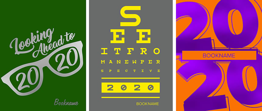
It’s a once in a millennium moment. We won’t have a repeating double digit year again for a thousand years. If you were planning a 2020-related theme, we have a vision for you. Advisers have been excited for years for THIS school year. How can you not do a vision-related theme this year? So, if you’re game for a 2020 theme, look no further (sorry, we can’t help all the vision puns). We’ve got 20 ideas for 2020 yearbooks.

1. Choose a cover We have several 2020-related covers in the SimplyCreate collection. Pick one that serves your vision.
2. Visualize vision. If you’re going with the literal vision idea, go all in with the graphic look. Eye charts, eye exam machines and glasses can all add to the ahem, vision. (See #10 for another example of this.) If it’s within your budget, play off the vision theme by doing a clear or mirrored Plexiglas cover.
3. Get graphic. If you’re focusing on more of a perspectives or Roaring ’20s vibe, have fun with the visual look. Perspective themes could have bold graphics with unusual or 3D effects to give them dimension and a changing perspective feel. Roaring ’20s themes should utilize art deco touches and novelty fonts like Central Park, Matthew or Society Column.
 St. Louis Park High School and Hudson Bend Middle School both utilized graphics in 2019 that gave a 3D feel. In 2017, Jesuit College Preparatory School of Dallas incorporated an art deco look to emphasize their “Classic” theme.
4. Try a different phrase. A 20/20 vision theme is the obvious choice. But if you still want a 2020 vibe without the literal take, consider spinning off the concept with other theme phrases. Try “Focus,” “Don’t Blink,” “Look at it this Way,” “See What I Mean?” or “The View from Here.”
5. Verbalize it. Expand the theme with verbal spinoffs for module headlines. There are hundreds of ways to say look, vision and perspective. Take the best phrases that connect with your spreads and run them on modules throughout the book. Need help? Here are 75 vision-related headline ideas.
6. Find a fresh perspective. Think creatively about photography for a look or perspective-like theme. Use a Go Pro or fish-eye lens for a unique, wide perspective on a crowd, event or game. Consider a camera water housing to photograph swimmers under water.
7. Photograph from a different perspective. Take pictures down low for a worm’s eye view; snap photos from up above for a bird-eye’s view. Go to unusual locales for a fresh perspective—at a football game for example, sit in the stands with the band and try a wide angle shot that features a member playing up close with the game happening in the distance. At a performance, try shooting from the wings, behind the stage.

Unusual vantage points made these photos from Allen High School (left) and Aransas Pass High School (right) provide a fascinating and different field of view.
8. Utilize reflections. Take advantage of car mirrors, puddles, shiny band instruments and mirrored sunglasses for cool reflection photos.
9. Use unique cropping on mug modules. Draw attention to mugs by creatively cropping ones used in modules and secondary coverage packages. Ideas: crop tight at the forehead, feature only half of the face, showcase only the eyes, or scoot mugs over so they’re off-centered using rule of thirds. (Note, we’re talking about mugs in sidebars, not the actual school portraits.)
10. Celebrate glasses. If there’s one year to feature glasses, this is it. Create a module or two that showcases cool specs. Run another one on sunglasses.

Vista Ridge featured student sunglasses in their people section. It’s a cool way to include additional students that aren’t involved in clubs and sports.
11. Showcase selfies. It wouldn’t be a vision theme if we didn’t look back at ourselves. Have modules with selfies at various campus events: pep rallies, Homecoming, club activities and games. Featuring real events will provide more substance and connect to the year than random selfie images. The selfie module is also a sneaky way to get posed photos in the book and plenty of students in minimal space. Also, consider doing an entire spread of social media selfies, possibly connecting to the season with an “InstaSummer or InstaWinter” spread.
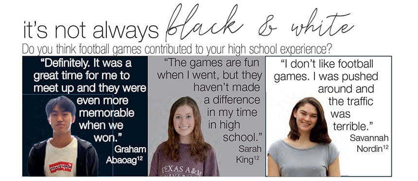
12. Feature different perspectives. Showcase different perspectives through the verbal coverage. Consider “he said/she said,” “agree, disagree, neutral,” and “two sides to every story.” It’ll allow you to include more students and play off the theme in a creative way.

For their 2019 theme, “3 sides to every story,” Memorial High School created cutout and quote sidebars featuring multiple viewpoints
13. Feature even more perspectives. Go even further with the perspective idea and feature numerous viewpoints and people, as in more than two or three. For instance, consider a module on the volleyball spread that showcases other vital people to the game: managers, fans, parents, coaches, trainers, photographers, announcers, etc. Get their thoughts about the game and suddenly, you have a multitude of perspectives.
14. In 20 years . . . Add a whole-book link that asks students what they’ll be doing in 20 years. This can be especially fun for elementary, middle school and K-12 books.

For their 20th anniversary in 2016, Hill Country Christian School chose “Perfect Vision” as their theme. On each spread, they ran a whole-book link asking students where they’ll be in 20 years.
15. In one word . . . Create a module that features 20 one-word answers from students. Have students pick a single word that describes their personality or their year. Or ask them to name their favorite snack, song or hobby. With the short answers, you’ll be able to feature a lot of students in a small amount of space.
16. In 20 words or less . . . Run a bit longer answers by letting students answer a question in 20 words or less. Design this module in a skinny vertical place to run in the people section or with a clubs, academics or sports spread.
17. Play 20 questions. Turn the normal Q&A into an extended one with 20 questions. Profile one student or several. Run as a sidebar on a club or sports page, or include in the people section.
18. Top 20 list. Forget top 10 lists. It’s 2020. It should be a top 20 list. Think trends, movies, songs and snacks—all items that can elicit long lists.
19. 20 excuses . . . Keep going with numbered lists by featuring types of excuses. Think missing homework excuses for the academic section, both real and fake ones (sometimes, the dog really did eat the homework!). In the people section, run best excuses for being late, failing a test or missing class. On the flip side, include the best excuses and lies parents told their children.
20. 20 for 2020. Dedicate space to profile 20 students. It could be student leaders, class presidents, sports captains or unique students with a story to tell. It’s a great way to connect to the theme and provide another perspective on students’ lives.

