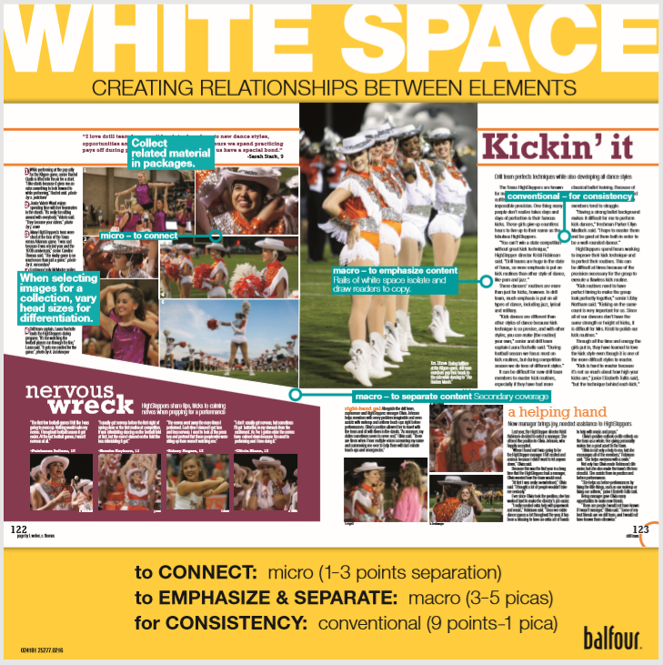
It is not what your readers are looking for. In fact, they are probably unaware of it. Nonetheless, white space is an important element of design. It directs readers to content on the spread: photos, copy, graphics and type. At first glance, we see elements and their relationship to each other before we actually see the content. The right amount of white space separates or connects elements on a spread. For example, isolating an element with a grid of white space indicates that each group is a separate entity. On the other hand, a point or two of white space groups elements and suggests a relationship between them.
Check out our Balfour Square handout on White Space.


