
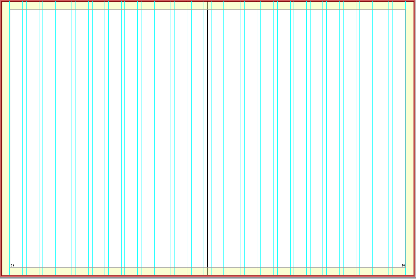
External margins are the areas of white space that frame the spread. The margins are there to keep staffs from designing elements too close to the edge of the page. But the default settings are very small. In StudioWorks+, the external margin is two picas (this is the yellow border on the layout below). In InDesign, it’s three picas. With six picas in an inch, this is only one-third to one-half of an inch of white space, a very slim margin. In all honesty, it’s just too small.
With our natural tendency to design all the way to the edge of the content area, this creates a very crowded page. All the elements seem crammed in with little room to breathe. If the margins are increased slightly, then the elements inside the content area would not be so close to the edge. Suddenly, they have room to breathe and the page has more flow.
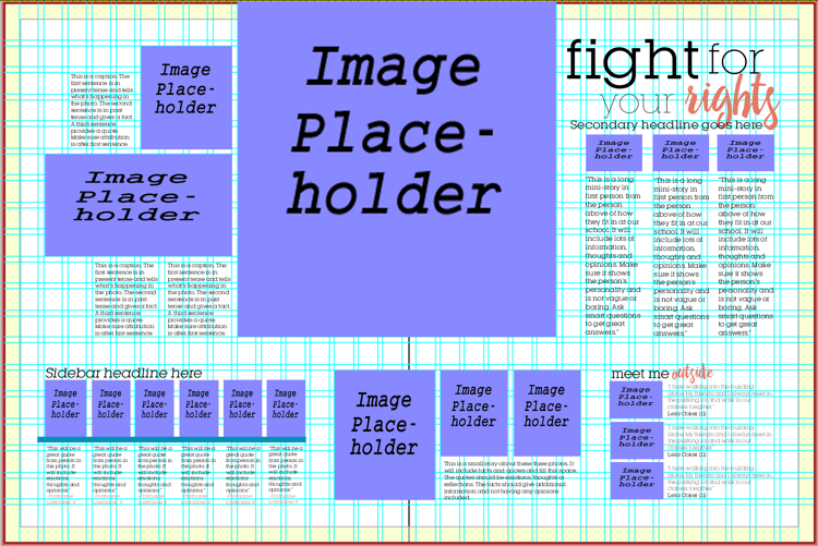
A healthier margin is four to five picas (maintaining one to two picas for the inside margin near the gutter). This change has a minimal impact on the content while having a maximum impact on the look of the page.

Advisers often ask how to improve their books or how to win awards; changing the margins is a huge step in the right direction. Look at nationally award-winning books and you’ll notice they don’t have tiny margins. They have nice, fat wide margins that give additional white space around the spread content.
So, how do make this change?
In InDesign, it’s simple. You adjust the margins by going to the Margins and Columns option under the Layout tab in the Menu bar. (Keep in mind, you’ll need to break the link icon to make sure it doesn’t adjust ALL the margins. Otherwise, the inside margin will be four picas too.) We suggest anywhere from four to five picas for the top, bottom and outside margins. If you prefer symmetrical margins of equal space, set the top, bottom and outside margins to the same number of picas. If you like additional space for a larger folio, add an extra half to full pica to accommodate. Some staffs prefer a middle ground and will use 4p6 for all the margins or 4p0 for top and outsides and 4p6, 4p9 or 5p0 for the bottom for a little more cushion.
In StudioWorks+, it’s a little different but still possible. While you can’t make the yellow portion of the layout bigger in SW+, you can create bigger margins in three possible ways:
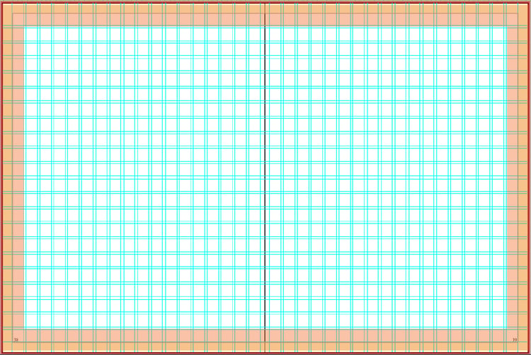
Option 1: Add multiple columns and rows to create a grid. The vertical and horizontal rail closest to the yellow margin is the extended margin. To ensure it is equal spacing all the way around, use a grid that creates squares, not rectangles. Also, to make sure the new margin isn’t too large, you’ll need a lot of rows and columns. To create a grid, go to the Full Menu Options icon (the one with the three horizontal lines and go View>Preferences. Under the Guides tab, select no Grid and adjust the number of columns and row spacing. The number of rows will have to be slightly larger than the number of columns. (A few suggestions: 17 columns and 14 rows, 19 and 16, 22 and 19 or 24 and 21.) You can also adjust how large the space is between columns and rows, often called a gutter. In StudioWorks+, it’s referred to as column spacing and row spacing. Since there are more columns and rows, consider choosing a smaller amount of space like 6 or 9 instead of 12.
Notice how the grid closest to the yellow margin at the bottom does not contain any
content. This helps in creating a wider margin.
Option 2: Place an outlined box or individual lines on the preferred margin and let students know they should not design past those lines. Use a bright color like red or orange to make it really noticeable. You can lock these lines/bars or place on the master pages. If you go with this option, make sure to remove the box or lines before you submit pages to Balfour.
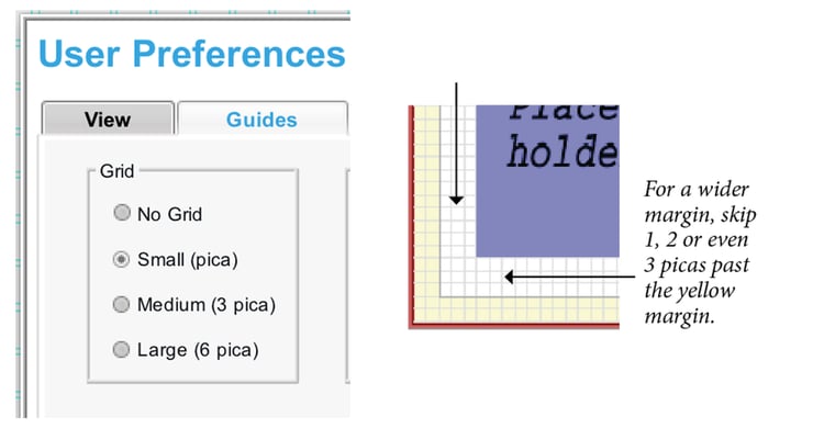
Option 3: Use the document grid to establish a wider margin. Under the Full Menu Options icon, go to View>Preferences>Guides. Select the Small (pica) option which provides a 1-pica grid. Using the 1-pica grid, decide how many additional picas of margin you want past the yellow area. An extra pica would provide a 3-pica margin, two picas would be a 4-pica margin. Let students know they should skip one, two (or however many picas you designate) past the yellow area when they place photos and text. Photos that bleed off the page would still go to the outer edge of the yellow border. If you feel it’s necessary, add a box or lines along the pica grid to make the new border clearer to students. Just as noted earlier, make sure to delete before hitting submit.
Adding this small bit of white space is a simple way to improve the design of a spread. It makes the pages feel less crowded, lets elements have a little more room to breathe, and provides a clean look. It’s the little details that can make a big difference in a yearbook.
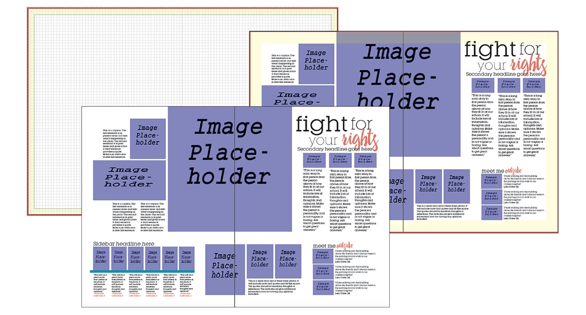
Leander High School is a StudioWorks+ book that uses grids to create a wider margin
instead of using the 2-pica default margin.
