Sharing ideas is one of our favorite parts about yearbooks. But lists tend to be long and text-heavy. As we brainstormed people coverage ideas, we thought it might help to see more visuals. Here are six cool people spreads to inspire your staff.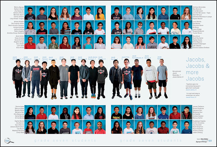
The name game People’s names can amp up the coverage factor in the people section. Focus on unusual names, origin stories, or the commonality of first or last names. Stanford Middle School featured two name module in 2020, this one on boys named Jacob. Even if you’re not in person, students could send you mugs or head-to-toe photos to cut out.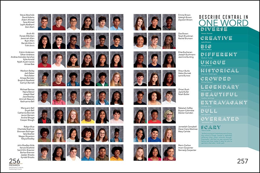
Type-tastic Sometimes, the coolest mods have zero photos. Try a typographic design like this one word module from Little Rock Central High School. In addition to the eye-catching design, it’s a smart way to include students who are less talkative. See more image-free spread ideas here.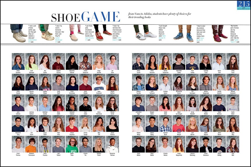
Just for kicks Fashion coverage provides a fun diversion from blocks of portraits, like this shoe module from Minnetonka High School. Despite its slim design, the sidebar features seven students. Also, the simplicity of the photo composition makes this easy content for virtual crowdsourcing requests. Other potential designs could include just the shoes or venture into related fashion territory, focusing on high heels, boots, sandals or socks.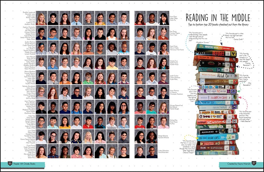
Page-turner As a publishing company, we’re quite fond of books. And they make great visuals on a yearbook spread. This people module features a stack of the most popular books checked out at Ridgeview Middle School. Other graphic packages could spotlight student favorites or required reading. Don’t stress if you can’t gather all the books at once. Photographing books separately and using throughout the mod also creates a compelling design.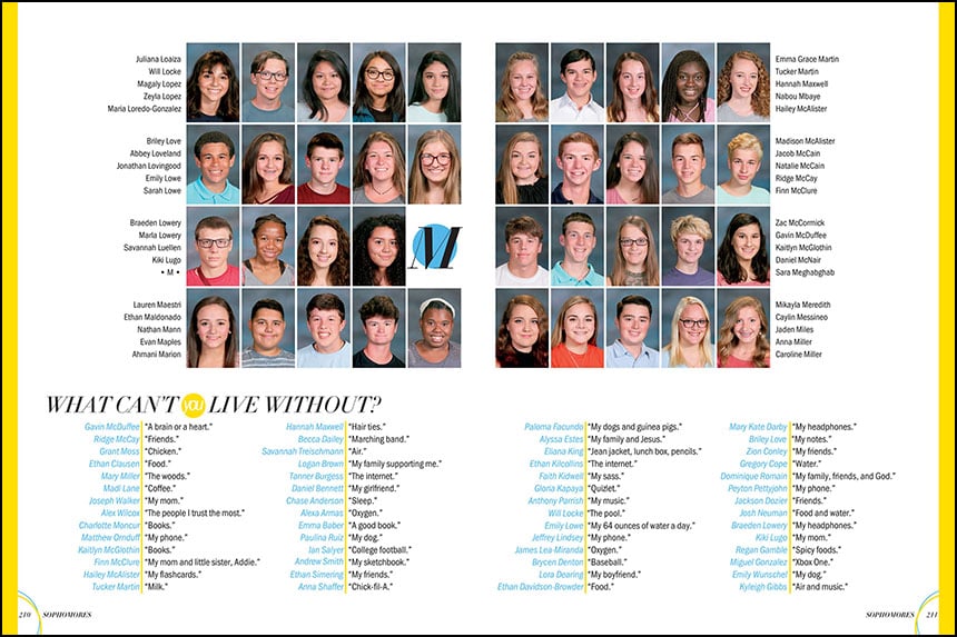
Short on answers, long on content As staffs struggle for photos and coverage, let this quote module inspire your people section. Hardin Valley Academy created several text-only packages to feature more people in the 2019 Flight. And it works. They included 48 students on the spread. The use of color, lines, text alignment and spacing add to the visual appeal.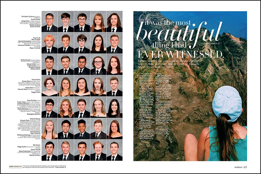
Let me tell you a story As we mentioned in our previous coverage post, profiles are the bread and butter of the people section. They’re an opportunity to showcase strong photography and share interesting stories about your student body. In 2019, Vista Ridge High School’s staff spotlighted a senior’s memorable hike in Hawaii.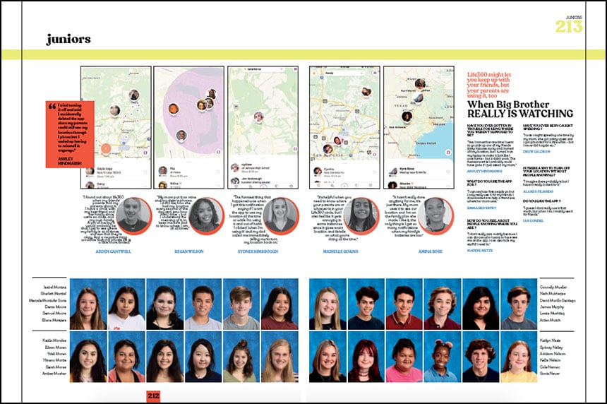
Where are you? Cell phones and apps are easy choices for people topics. But we love this take from Claudia Taylor Johnson High School. They featured Life360, the location-sharing app that families use to keep track of each other. Similar designs could feature cracked cell phones, screen time statistics and cell phone cases.
For more ideas: Check out the four-page people coverage ideas handout. We’ve also added 130-plus spread examples to the coverage page on the Balfour Exchange.
