

Merriam-Webster defines personal space as the distance from another at which one feels comfortable talking or being next to that other person. There’s an instinctive desire to protect this invisible region around ourselves. We should use the same concept when thinking and planning design.
For more than 20 years, we emphasized the one-pica rule. All elements should be one pica away from each other, we admonished advisers and staffers as they planned their yearbook pages. But as design has evolved, so has our philosophy. Here’s a breakdown of spacing suggestions so that everything feels comfortable.
External Margins
These are the outer borders where the design stops before the edge of the page. For years, the standard was a 2 to 3-pica external margin. But we’ve increased those margins to 4 to 6 picas now.
The additional white space shrinks the design slightly, but makes a compelling difference in the look and feel of the spread. Suddenly, the design has more room to breathe and the elements no longer look cramped, like they’re trying to escape off the page. Readers will appreciate the deliberate white space. For a more in-depth discussion of external margins and how to adjust them, see our post about margins.
 Foster High School and Vista Ridge High School both used wider external margins in 2018. Foster is a StudioWorks+ school that used a grid design to increase their margins to about five picas. Vista Ridge is an InDesign school that changed their margins to 4p6.
Internal Spacing
There are three levels of white space that provide the personal space our spreads need.
Macro:
The largest spacing on the spread, macro spacing is used between modules. It creates space that emphasizes and separates packages on the spread. Think of it like personal space, where the package is designating the needed breathing room. Usually 3 to 5 picas, macro spacing creates a rail of white space between the package and other elements of the design. If you use grid design, ideally the grid width or depth would be used for the macro spacing.
Micro:
The smallest spacing on the spread, micro spacing is used for elements within sidebars or modules. It draws photos or elements closer together, showing their connection. Micro spacing is invading the personal space, but in a comfortable way, like when a couple hold hands or people hug. While we suggest 1 to 3 points of separation, many schools have opted for 4 to 6 points which works well for micro spacing. Some staffs have also set their gutters at the micro spacing point size to make sure elements line up on the column or grid structure.
Conventional:
The standard spacing on the spread, conventional spacing is used between traditional photos, captions and stories. It provides a consistent separation between elements. In relation to personal space, think of conventional spacing like people taking a group photo. They’re standing near each other, usually with equal space between each person. Nine points to 1 pica are the recommended sizes for conventional spacing, especially for multiple columns of text. Staffs often set their gutters to 9 point or 1 pica to coincide with the conventional spacing.
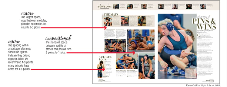
A wrestling spread from the 2018 Klein Collins books shows examples of all three levels of white space.
Spacing Debates:
An interesting development in the last few years is staffs opting to use only two of the three levels of white space. They’re eschewing micro or conventional spacing, choosing one over the other. If this works for you, we’re all for it. But we highly recommend utilizing the macro spacing with the micro or conventional space. It’s a simple change that alters the dynamic of the spread. It allows numerous elements to be included without feeling crowded or claustrophobic. And it helps direct the reader where to go.
Holy Trinity Episcopal School often uses two of the levels of white space, the micro and macro levels. Each grouping of photos is set close together to indicate they are connected. The macro spacing between the packages provides rails of deliberate white space to create emphasis and separation.
White space creates a dramatic impact with yearbook design. These suggestions should provide the design a little space to breathe. Because we all can use a little personal space.
