“On the average, five times as many people read the headline as read the body copy. When you have written your headline, you have spent 80 cents out of your dollar.” –David Ogilvy, British advertising executive, known as the “Father of Advertising.”
The headline is the first impression on the reader and if you’re not careful, it might be the last. It’s critical to write enticing headlines that attract the reader visually and verbally.
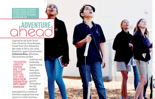
This headline package from Holy Trinity Episcopal Academy packs in visual and verbal connections. An alliterative main headline utilizes different fonts, color and uppercase and lowercase styles. The secondary headline, placed in a colored block, provides detail about the annual event.
VISUALLY
Create an entry point. The main headline should be large enough to anchor the spread, grabbing readers’ attention and directing them to the copy and dominant photo. They establish the headline hierarchy, running significantly larger than any other headlines. (A good rule of thumb is to use the dominant photo formula maxim: main headlines should be two to three times larger than other headlines.)
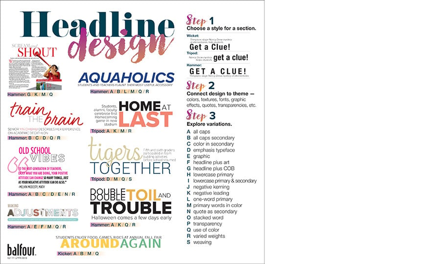
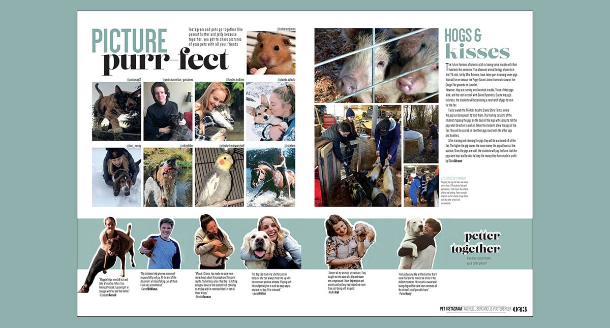
Use type creatively. Headline design is crucial to its attractability. Utilizing font weights, sizes and color can provide contrast and emphasis. Learn more about high impact headlines here.
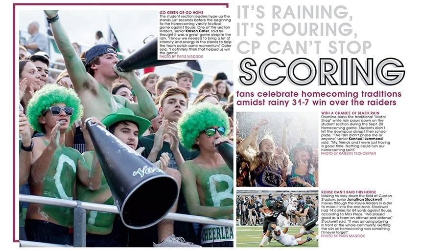
For their Homecoming coverage, Cedar Park High School uses a rhyming pun headline to illustrate the wet weather and successful game. A secondary headline is significantly smaller and reveals essential details, including the score and opposing team.
VERBALLY
Capture readers’ attention. Intrigue the reader with a clever headline, often a catchy phrase or literary device. The primary headline serves as “the teaser,” enticing the reader to read more. Avoid using label headlines (Student Council, Volleyball) that fail to grab readers’ attention. Instead, save that important information to run with the page folios.
Don’t just tease. In addition to “the teaser” headline, you need a secondary headline that serves as “the teller.” Written in present tense with a subject and verb, the secondary headline clearly identify the spread’s focus. It provides details about the story or spread, telling something specific about the season, club, event, etc. Avoid running a teaser-type for both the headline and subheadline, or excluding a secondary headline altogether. They’re essential for letting your reader know what the spread’s about.
Establish a visual-verbal connection. The message of the spread is illustrated by the dominant photo and supported by the headline. Reflect the dominant photo’s content with clever diction and clear details.
