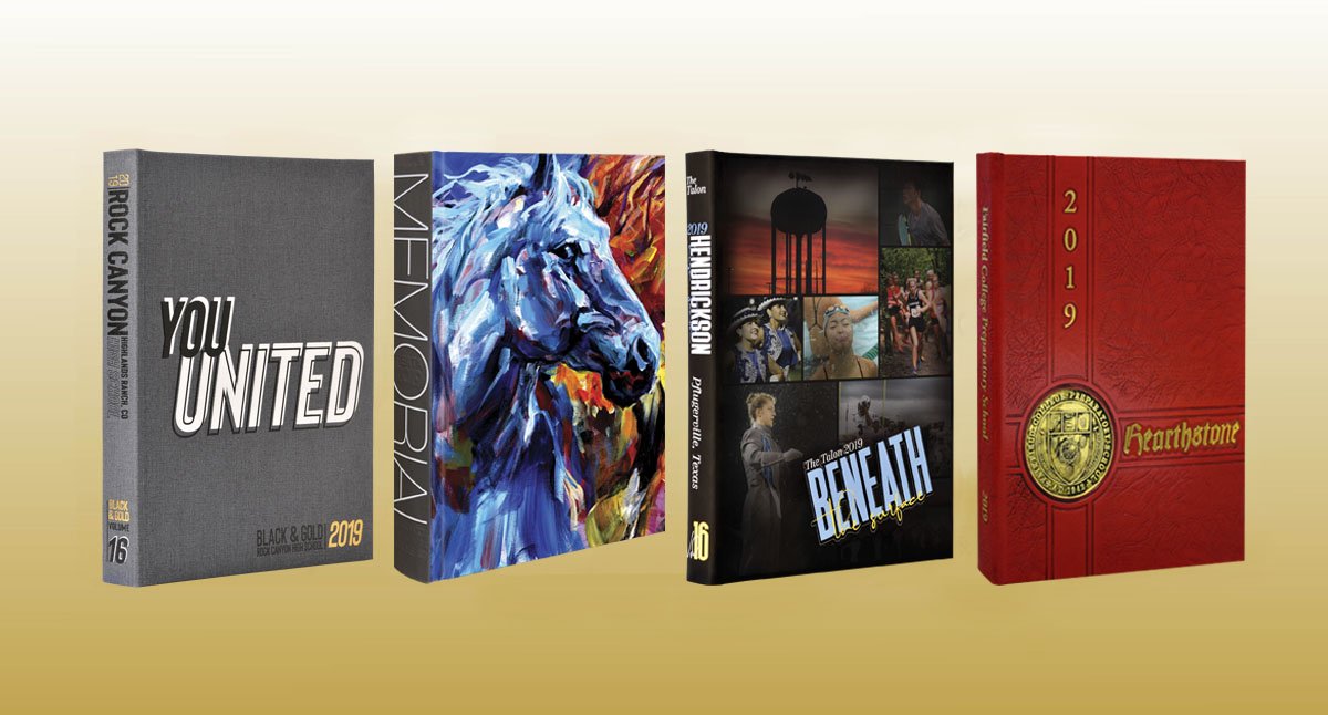
Sometimes, it’s okay to judge a book by its cover. The cover is the first thing students and potential buyers see. There are multiple cover options to showcase the theme and wow the audience. The cover gives the first impression of the book; make it a good one.
There are two basic types of yearbook covers: school-designed and Balfour’s professionally-designed simplyCREATE cover collection. Depending on your staff’s creative resources, theme and budget, your Balfour representative can help choose which option is right for your school. Learn more about simplyCREATE covers here.
For school-designed covers, the yearbook theme comes together with the cover design. Seeing the cover can excite a yearbook staff and propel the rest of the book. But the cover is more than just a theme phrase, fonts and colors. There are hundreds of cover applications that can complement your theme.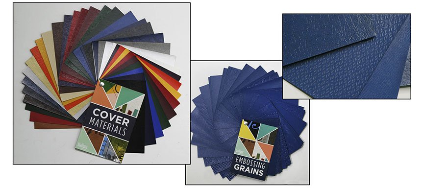
MATERIALS
Choosing the cover material is one of the first steps in creating an impressive cover. An affordable option for hard-back yearbooks is Lithocote. Lithocote material allows the school to create a four-color cover using the same printing process as the pages in the book. After printing, the material is laminated with a gloss, matte or soft-touch finish.
Another option is Lexotone, a cover material with a leather-like look and feel that comes in a variety of colors. Grains often are applied to Lexotone covers to provide an even more leather-like appearance. Korigan is a similar leather-like material, but with a thinner weight. Korigan covers come in several colors but they can’t be grained or embossed.
A third leather-like option is Frontier, which comes in blue, navy and a dark maroon. Graining and overtoning are not recommended due to the material’s textured appearance. The final standard cover material, Matte, features six colors in a more subdued look. The covers have a matte finish with a softer feel.
In addition to standard cover materials, there are hundreds of premium options. Iridescent materials, which come in a rainbow of hues, provide a shimmery look to the cover. There are smooth iridescents as well as luminescent versions with a texture. Another popular choice is linen cover material, from very fine threads to a coarse feel. Other cloth materials include burlap, blue jean, real leather and velvet.
COVER APPLICATIONS
There are a number of ways to customize the cover. Foils, grains, die-cuts and other applications can enhance the theme, setting the tone for the concept at first glance.
Silkscreen- For this affordable option, ink is applied through a design stencil. Silkscreens can be applied on all standard cover materials, as well as on premium cover materials.
UV coating- This clear silkscreen varnish gives a reflective shine to the cover. Often used in small areas to emphasize letters or images, UV coatings come in a variety of finishes and tints.
Foil stamping- A die is created and used to stamp foil into the cover material. There are dozens of foil options, including traditional foils like silver, gold and copper as well as bright metallic greens, blues and reds.
In 2017, Vandegrift High School (left) chose a brushed aluminum foil while Hendrickson High School (center) and Westwood High School (right) picked blue and copper foils for their 2018 books.
Tip-ons- Laminated photos or art are laid by hand into a debossed area.
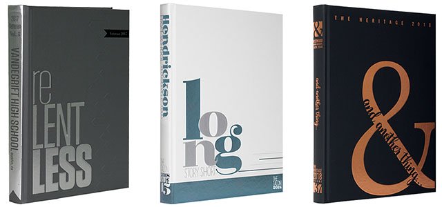
Embossing/debossing- A brass die is used to raise or lower areas to bring out the design. Foil and UV varnish coatings often are added to embossed and debossed text or images.
Thermoscreen- A raised silkscreen design is a less expensive alternative to embossing. It can be applied on Lexotone or Korigan cover materials.
Graining- Texture is applied to the cover material through the use of a grain plate. There are dozens of grains to choose from, including line, circle and leather-like textures.
Metalique- This modeled foil application is multi-dimensional with details like a coin. School logos or emblems are often featured as metaliques.
Toning- Applied by hand, antiquing toner is rubbed into a grain, embossed/debossed or metalique area to give a rich look to the design. The toner fills in the crevices on the cover, especially with grain. Toning is often black, but could be any color. After toning, the cover is waxed to give the final weathered, antique look.
Die-cut- A die is created and used to cut specific shapes out of the cover. This can be one simple shape, like a triangle or square, that reveals an image or text on the front endsheet. Another option is to die-cut letters, usually part or all of the theme wording. When adding die-cuts to a dark-colored cover, it’s smart to upgrade to black binder board; this will avoid showing light-colored binder board edges where the shapes have been removed.
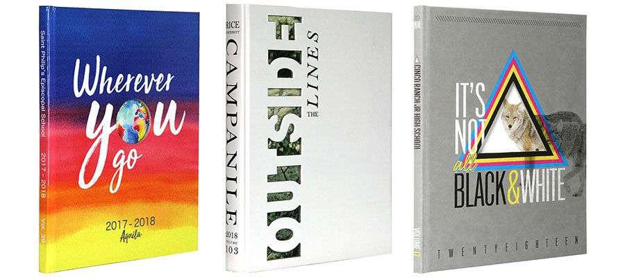
Die-cuts can come in a range of shapes, include geometric like the Saint Phillips’ Episcopal School (left) and the Cinco Ranch Junior High (right) 2018 covers. While letters are common die-cuts, the Campanile staff chose to create a die out of the voids between the letters for the 2018 Rice University yearbook (center).
SPECIALITY COVER APPLICATIONS
If you’re looking for an even bigger “wow” factor, consider a premium cover option. From slip cases to mirrors, upgraded looks can delight audiences and take the theme to a whole other level.
Laser cut- This type of cut is used for small, precise cuts when creating detailed cutout shapes. They are often used when tiny cuts are needed to create a bigger graphic, like a mascot, or with a long word that is being cut out of the cover. Laser cuts also can be used for intricate cutouts on the endsheets.
Multiple covers- The same design is created in multiple colors. Schools usually choose from two to five options.
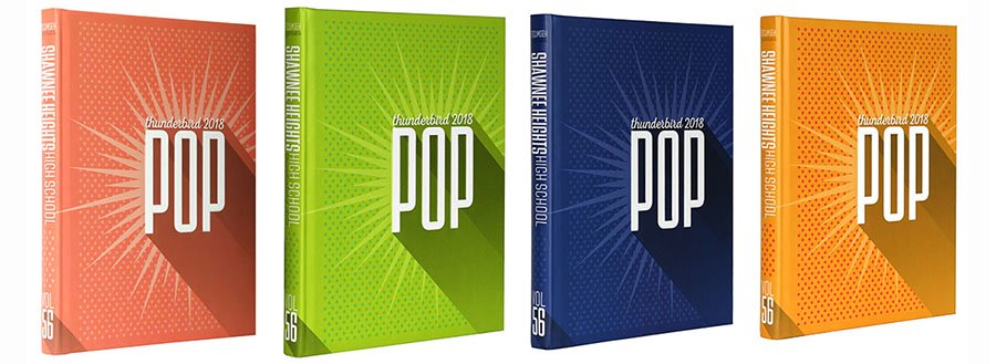 Shawnee Heights High School featured four different covers for their 2018 theme, “Pop.”
Quarterbound- The spine and a small part of the book are covered in a different material from the rest of the cover. Often yearbooks feature a vertical quarterbound with the second material running along the spine and one to three inches from the spine on the front and back lid. Another option is to have a horizontal quarterbound with a different material running horizontally across the book and extending to the back lid.
Air texture- This rough varnish gives a gritty texture to the book, similar to sandpaper. Air texture can be applied to Lithocote covers.
Plexiglas- Clear or colored acrylic cover material gives a view of the endsheets. The acrylic runs across the front lid of the book and can reveal almost all of the front endsheet or only a small portion. Plexiglas can be paired with virtually any of the materials, but is easiest to reveal with linen.
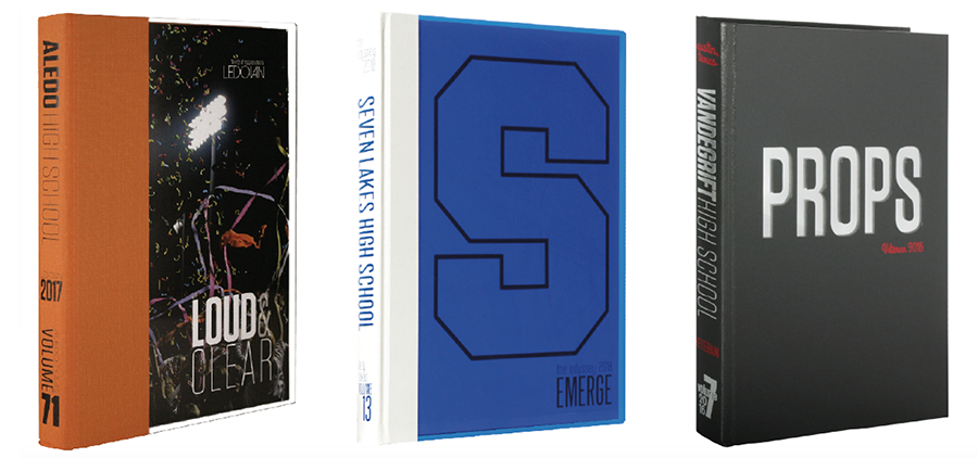 In 2017, Aledo High School (left) featured a stadium photo on the front endsheet that is visible through the clear Plexiglas. The cover is quarterbound with an orange linen material. Seven Lakes High School (center) choose a blue Plexiglas that reveals an “S” on the endsheet for its 2018 book. For its 2016 book, Vandegrift High School added mirrors to allow buyers to see themselves, a connection to the “Props” theme.
Mirrors- Reflective acrylic comes in multiple colors. A large part of the mirror could be revealed or only a small portion, possibly behind the letters of one of the theme words.
Dust jacket- As an addition to a hard cover book, a thin, laminated soft cover wraps around the hard cover book like jackets seen on hard cover novels. The dust jacket is pre-creased to help it fit nicely around the book. Often dust jackets are highly detailed or decorative and paired with a simpler, more classic cover. This is a fun option if you want to have two versions of your cover or feature a theme with an unwrapping, uncovering or revealing concept.
Spinner- This type of tip-on features a wheel. As the wheel turns, different words, colors or images are revealed. Usually, the area where the spinner goes is debossed to keep the tip-on from protruding too much.
Lights- Illumination is added to the book via a tip-in added to the inside front lid. Lights can be paired with Plexiglas to shine through to the cover or feature an animated light feature that blinks and moves throughout the cover.
Slipcase- Open on one side, this box holds the book. The open side, which can be the long or short side, reveals the spine of the book. (The short side is used for landscape books.) Slip cases can be used for one book, but often are used when multiple volumes are created.
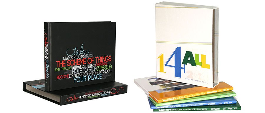
Hendrickson High School (left) and Arlington High School (right) added slip cases to their books in 2013 and 2014, respectively. The Talon staff turned the book sideways for a landscape view in honor of the school’s 10th anniversary. Arlington divided its book into four smaller books, three chronological by season and one reference, to fit into the slip case.
Clam shell- This type of box encases the book. The outside can have foil or silkscreen applications and the inside can feature different colors and text.
Cover pocket- This type of tip-on creates a sleeve on the cover. The pocket holds a supplemental publication, often a small book or magazine with additional coverage.
Wraparound- Reminiscent of an ’80s popular school binder, a wraparound cover has an additional piece of cover material that folds over onto the front lid. The folded-over portion could be magnetized to keep it closed.
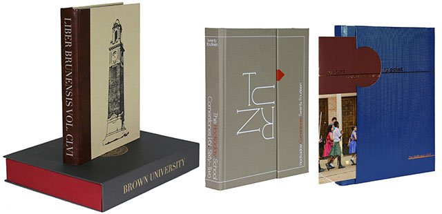
Brown University (left) added a clam shell to enclose its book in 2014. The Hockaday Day school (center) used a wraparound design for its 2014 book. St. Thomas’ Episcopal School (right) added a pocket sleeve on the cover in 2017 to feature the spring events, including the graduation of the school’s 30th class. The cover connects to the theme “starting point,” to emphasize the new beginning.
Mini-book- A small hard-back book is tipped on to the cover in a debossed area. These miniature yearbooks often feature striking photography and add a layer of theme development.
Chenille letter- Placed in a debossed area, this tip-on is an uppercase chenille letter, as seen on a letterman jacket. The letters come in various sizes and often are used with school spirit themes.
Louvered changing image- A die-cut reveals a photograph tipped inside the book, between the endsheet and the inside of the cover. The louvered tip-in, formed out of vertical strips, transforms into a different image when the cover is opened.
 McKinney Boyd High School featured a louvered changing image cover in 2015. When the book opened, the image changed to four new pictures.
Lenticular- A hologram tip-on changes the image when the book is moved. Lenticulars can be used to emphasize a word, feature two different pictures or show motion.
Glow in the dark ink- Ink that glows in the dark can add interest to the cover.
Thermochromic ink- A heat-sensitive ink applied to a printed Lithocote cover material reveals images when heat is applied.
3D- Three-dimensional images are featured and buyers are provided 3D glasses to see the red and blue images come to life in full 3D color.
Burnishing- This technique applies heat with a special embossing or debossing die for a burned-in look.
Gilded edge- A thin coating of silver or gold foil is applied to the edges of the pages.
 Staley High School added silver gilded edges to their 2018 yearbook.
Whether you’re looking for a little pizazz or a big wow factor, cover materials and applications can dramatically impact the look of your book. Work closely with your Balfour rep to find the right approach for your budget and school. Let your cover make a great first impression.
