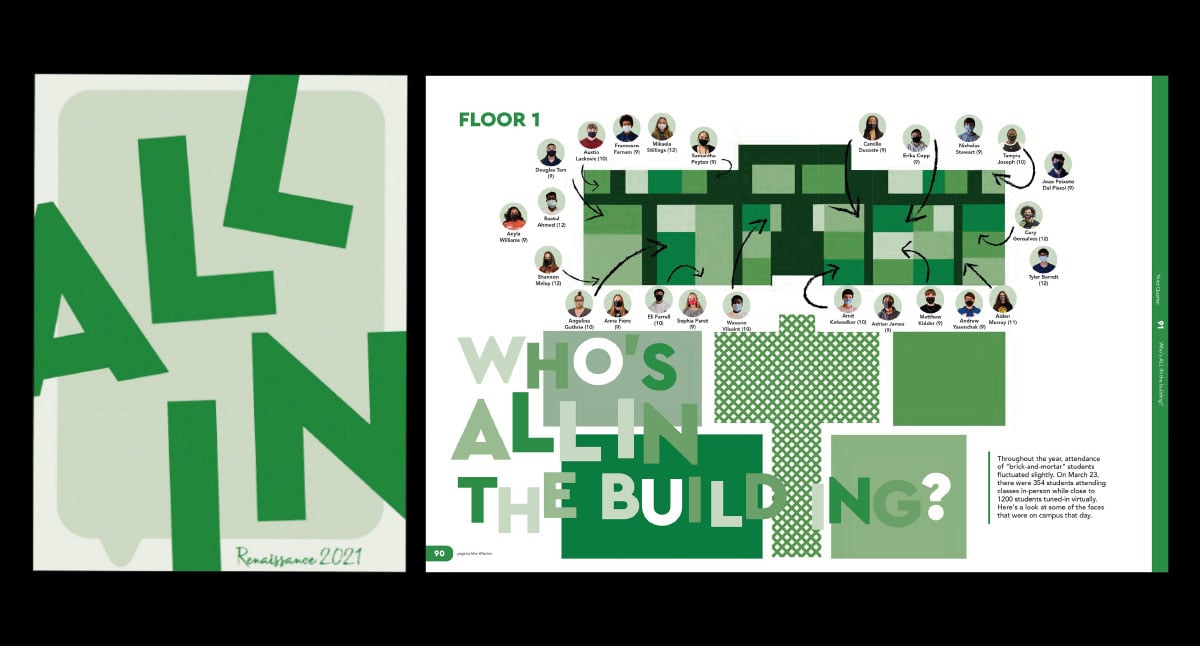
We know the drill: Put the theme on the cover, endsheets, opening & closing, dividers and the index. But the latest innovative trend is an expansion of the theme: specific pages devoted to the concept.
In the last few years, yearbook staffs have stepped up their theme game. Nowhere has that been more apparent than with dedicated theme pages. Often employing a wow, showstopper design, these additional pages go above and beyond the traditional theme expectations. For those just starting, here are five ways to easily broaden your theme coverage.
1. Student Life Coverage
Amplify your concept by integrating more theme coverage into the student life section. This could be as simple as profiles (see below) or topics that connect to your school, the year and the theme.
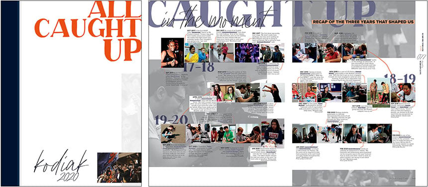
For the school’s third yearbook in 2020, Bridgeland High School chose the theme “All Caught Up.” Playing off that concept, the staff featured a double-page spread recapping highlights from the first three years. The headline also connects to the theme and the spread topic “Caught up in the moment.”
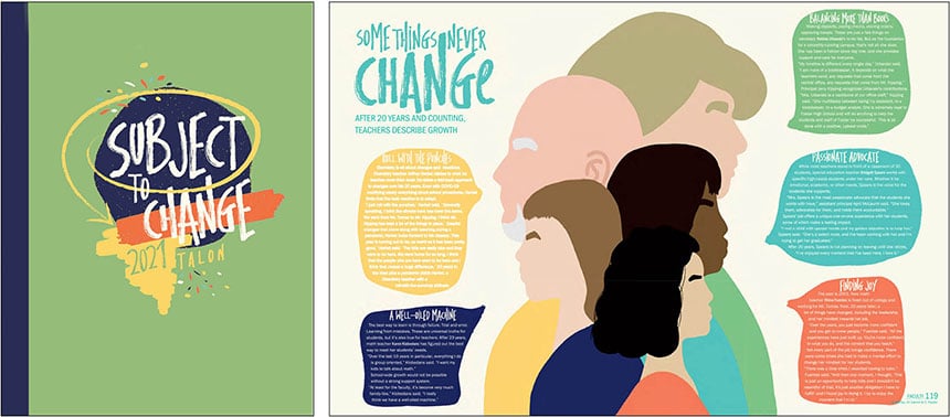
This spread in the 2021 Talon plays off their theme, “Subject to Change.” They spotlighted five staff members who had been at the school for 20 or more years, sharing their experiences at the school, and how they adapted and grew.
2. Profiles
Featuring students is the perfect way to connect to your theme, regardless of the concept. It’s also an impactful way to include more students in the book, especially ones not involved in clubs or sports. One simple way is to feature cutouts and quotes. Come up with a question that connects to your theme, interview students, feature their photos and create a cool design. Presto! Profile theme page done.
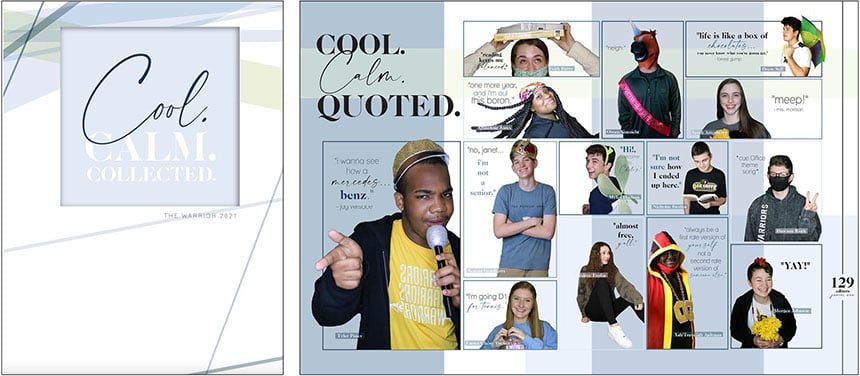
For “Cool. Calm. Collected,” The Warrior staff created two spreads connecting to the theme concept. They included 28 Oak Grove students in fun portraits with a favorite saying.

While profile pages tend to rely on cutouts and quotes, Bellevue East took a different approach. They devoted a DPS to each profiled student, writing a story and featuring several action shots. Like this senior who started his own business, each selected student embodied the “We’ve Got This” theme.
3. People Section
Another effortless way to expand theme coverage is with the portrait pages. All the ideas shared here can be reduced to fit in the people section. Add a theme-related headline and you have instant theme coverage.
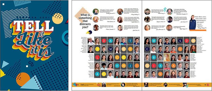
For their “Tell it Like it is” theme, Ridgeview Middle School employed students to do just that. In the people section, the staff crafted fun questions to elicit candid answers from students.
4. Interactive
By far, the easiest way to expand beyond typical theme coverage is with interactive pages. They’re also fun to design and a phenomenal way to personalize their book, helping buyers feel a stronger connection the book and the year. Simply choose your interactive format (quiz, fill in the blank, etc.), and write questions and a headline that connects to your theme.
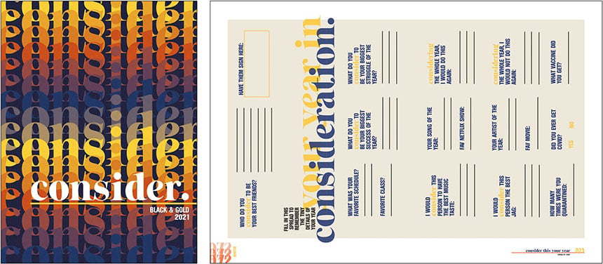
Rock Canyon High School features one to two interactive spreads in every yearbook, always connecting back to their theme. For their 2021 theme, “consider,” quiz questions asked students to reflect on good and bad moments, including “What do you consider to be the biggest success of the year? The biggest struggle?”
5. Text-only spreads
Before 2020, pictureless layouts were almost unheard of. Now, they’re gaining in popularity. And they’re another cool way to connect to the theme. They’re also an ideal way to include multiple students, especial virtual ones and the camera-shy crowd.
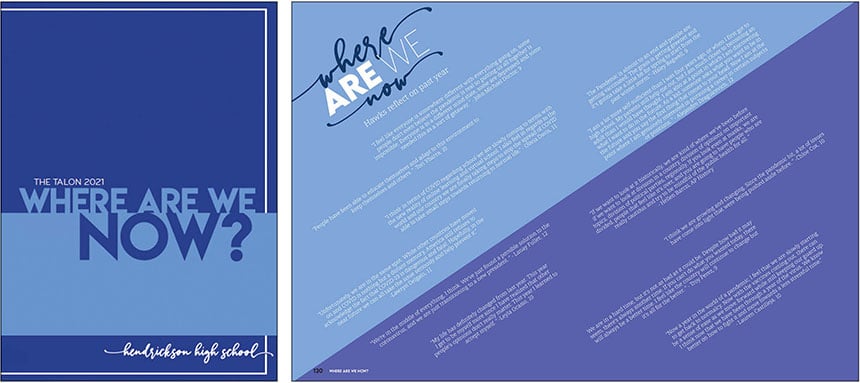
For their “Where Are We Now?” theme, the Hendrickson yearbook staff devoted a DPS to that exact question. Eschewing pictures, the designer used shades of blue, reverse type and a slanted design for the quotes reflecting on the past year.

Leander High School featured two pictureless layouts in their 2021 book, connecting both to their “Oddly Enough” theme. One spread focused on the lifted mask mandate, the headline asking, “252 days. Was it enough?” Students weighed in on whether they would continue to wear a face covering. In the above spread, students shared frustrations on what they were tired of. The enormous “Enough is Enough” headline makes a bold impact, while expertly connecting to the topic and theme.
Add the wow factor
While thematic wow pages take some ladder planning to create the additional space, they are well worth the effort. The pages are an opportunity to mix up your design, include more students in the book and connect to your theme in a new, innovative format. What will you design?
