What do you do when interviews and photos are limited? Take advantage of it! Use the lack of content to amp up the coverage and wow factor.
There’s never been a better year to focus on showstopping design. Showstoppers, also called wow pages, breakers, disruptors and interrupters, are layouts that eschew traditional design rules. The idea is to grab the reader’s attention with a compelling look that’s bold and fun. Think full bleed photos, cutouts and eye-catching color, type and graphics. Here are five strategic ways to plan and design:
1. Feature more anytime topics for fun coverage
Let’s be real. It hasn’t been the most fun year. And yet, we can focus on the positive. Bump up your student life coverage to feature some of the cool and fun topics your students are interested in. Consider trends, fashion, snacks, school supplies, art, hobbies, home cooking, music, holidays…the ideas are endless. (See our extended list of student life coverage ideas.) We envision coffee spreads and pages dedicated to goofy socks and pandemic plants. Have fun!
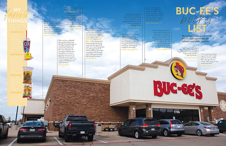 In Texas, students have an affinity for Buc-ee’s, the Walmart of rest stops. Hill Country Christian School dedicated a spread to the beloved convenience store that’s a guaranteed stop on road trips.
2. Take advantage of the photos you can get
While staffs are struggling for in-person images and events, think creatively about what you can shoot. Many of the student life ideas suggested are items that can be photographed easily by the adviser or staffers. Others can be crowdsourced by parents, teachers and students. Lean on mug and cutout options to replace typical class, club and sports images.
Also, consider seeking out general photos that can create a dramatic impact as backgrounds, dominant images and cutouts. This could be as simple as photographing a lone basketball on an empty court for a sports spread. Pixabay is a great resource for royalty-free images that can substitute for items you’re unable to photograph. (For example, Pixabay has images of coffee, phones, school supplies, sports equipment, etc.)
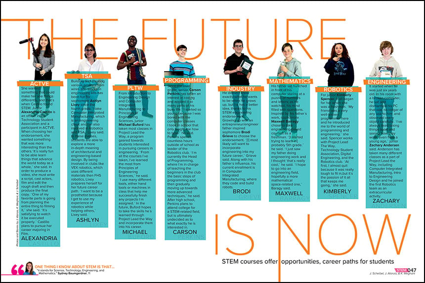
While virtual learning may interrupt typical classroom photography, consider using mugs and cutouts instead. In 2020, Foster High School featured individual photos of students to accompany stories about their experience in a STEM class. Combined with the colored boxes and strong typography, the design has a dynamic impact.
3. Utilize lay flat design for cool visuals
Showstopper, wow designs don’t have to feature full-bleed images. While that style has dramatic impact, it’s not the only way to create a compelling breaker spread. Lay flat designs have become a popular method to build stunning pages.
The term refers to images photographed from a bird’s eye perspective. The objects can be arranged on a flat surface to be photographed all at once or taken individually, to run as cutouts on a white, colored or textured background. With the recent popularity of ring lights, it’s even easier to take high-quality images.
Lay flat designs could be particularly helpful with topics that might be difficult to get candid and action shots, such as projects, electives, clubs and sports. Photographs of artwork, dioramas and other class projects can turn into unique coverage. Golf clubs or a tennis racquet could transform the look of a sports layout, especially if there are limited photos of students competing.
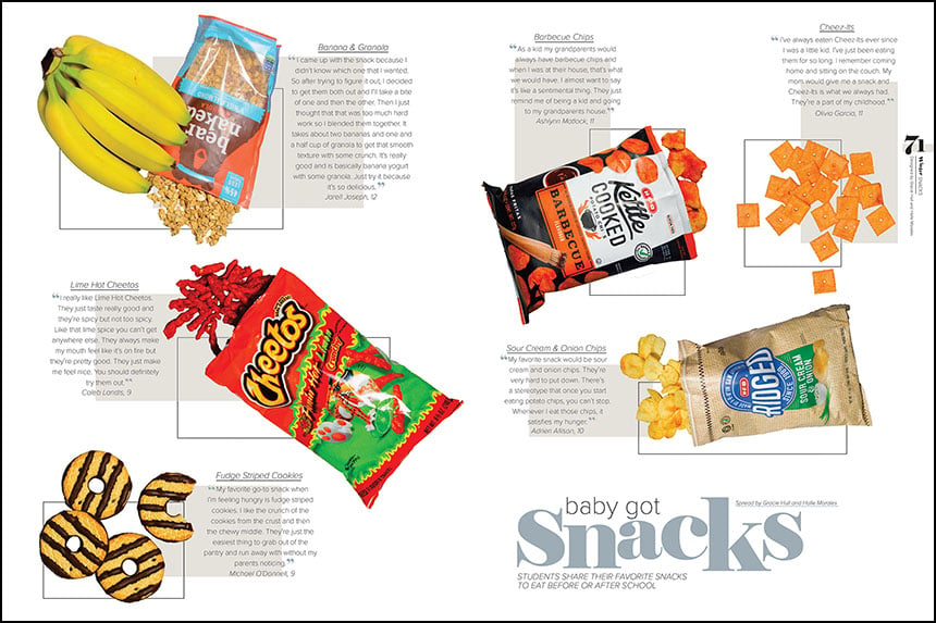
Klein Collins High School photographed and cut out snack food for this 2020 spread. The lay flat design is simple but effective.
4. Feature more color & typographic modules
In a year with fewer picture opportunities, it’s time to focus less on photos. Design layouts that don’t rely on images as the central focus. Consider creating pages that are solely typographical layouts or feature type-centric modules. Let those mods make the most of fonts, utilizing different sizes, weights and color. And speaking of color, use different hues and graphic elements to add visual appeal to a sans photo spread.
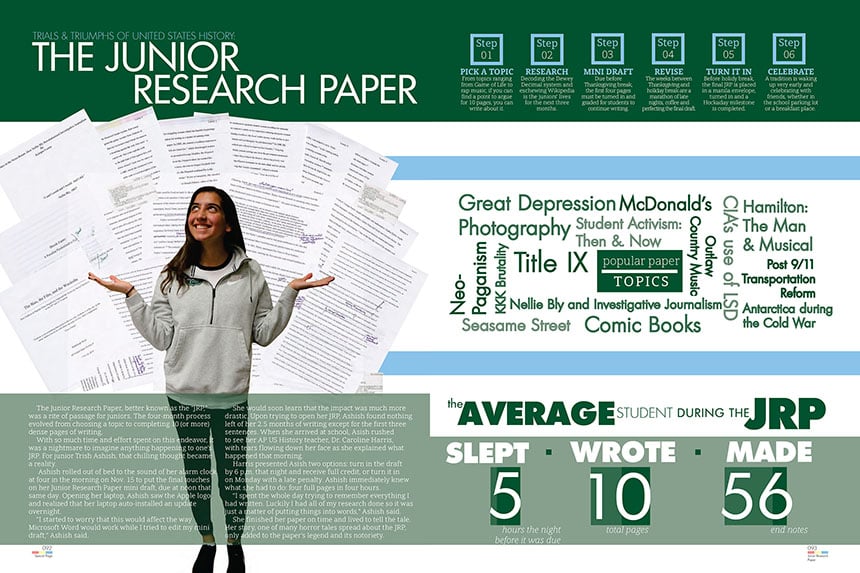
Combined with a single cutout, a flurry of typed pages create a dynamic duo on this research spread from The Hockaday School. The 2020 layout also features three modules with zero images. Each one uses typography and color to build appealing designs.
5. Embrace graphics
If real photos, even cutouts and mugs, are out of the question, consider taking a graphic approach. Let student art replace the images, whether it’s hand-drawn, painted or computer generated. Illustrations can be a welcome change, sparking new life into an old topic and completely transforming the look of a spread.
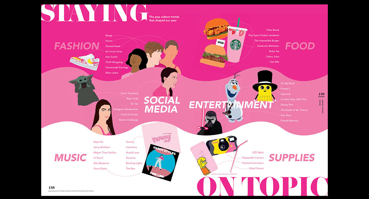
A popular option has been to utilize photo apps and software to create graphics. In their 2020 book, Suncoast High School colored photos in Photoshop and Procreate, turning images into colorful artwork (see the trends spread example at the top of this post). To learn how to mimic this technique, watch this tutorial on how to create faceless portraits in Procreate or Picsart. Here’s a second tutorial that explains how to turn photos into digital illustrations using a phone, laptop or iPad.
Other cool photo apps that turn images into artwork include Pikazo, Waterlogue and Portrait Painter. Creating art out of images is especially helpful with national coverage and copyrighted photos; the new illustrations are typically considered transformative, thus making it a fair use of the copyrighted material (note, creating an exact replica would not qualify).
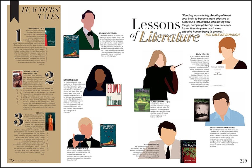 On a 2020 book spread, Portola High School created faceless portraits to feature characters from the famous literature.
Don’t let a lack of photos or interview sway you from great coverage. Think creatively about how you can use what you have and how you can create new visual opportunities. We can’t wait to see how you wow us with your showstopper designs.
