This won’t be your typical yearbook. It’s just not possible. And maybe that’s a good thing. It’s a chance to throw off the status quo and embrace change. Here are six ways yearbooks can, and should, look different this year.
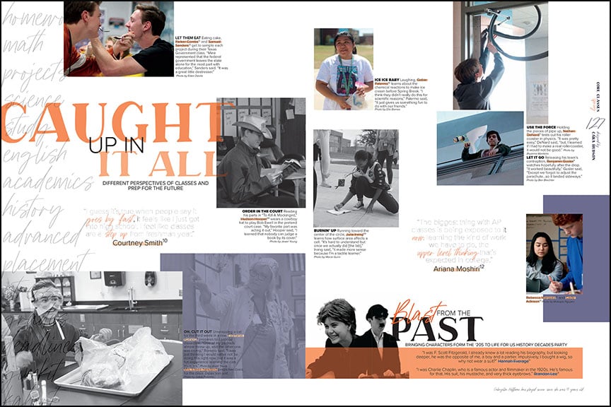
This isn’t your typical yearbook spread. The Kodiak staff embraced nontraditional design with many of the spreads in the 2020 Bridgeland High School yearbook, including this one on academics. The unconventional approach creates an appealing design with compelling photos and good use of white space.
1. Unconventional design
This is an opportunity to take risks with the design. Sure, you can still have traditional designs, but why not try something else as well? Find inspiration from professional designers and embrace the unusual. Think more white space, big cutouts, less photos, unusual copy and caption placement. Have fun with the headline treatments: massive type, ghosted words, clipped off text and long narratives instead of a traditional phrase.
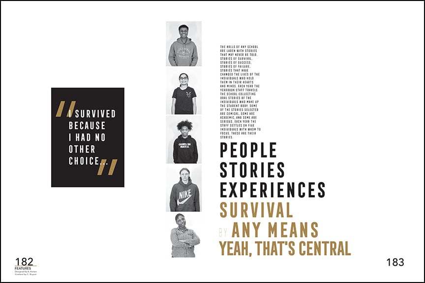
This beautiful spread introduces a series of profiles for the people section of The Pix, the Little Rock Central High School yearbook. The restrained use of pictures and text, combined with the ample space gives a magazine feel that’s as compelling as it is artistic.
2. White Space
Speaking of white space, this is the year to embrace it. With limited content and photos, use the empty space to your advantage. White space can have a huge impact on the look and feel of a spread. Move away from filling every square inch of a spread, going from corner to corner. Try using wider margins (4-5 picas) and macro spacing (3-5 picas) between packages. Consider expanding that space for more impact on spreads with profiles, features and showstopper designs. The minimal look will maximize the wow factor.
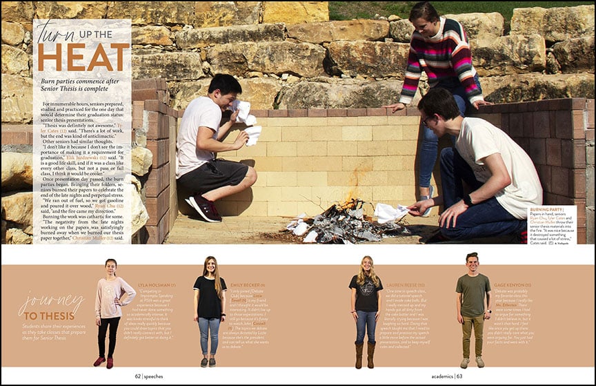
An academic spread in the 2020 Hill Country Christian School yearbook, this layout only features one candid photo. Despite the minimal pictures, eight students are featured on the weighty topic of the senior thesis (an additional senior is quoted in the story).
3. Less photos
Say goodbye to collages and spreads with 20-plus photos. Embrace layouts that utilize less photos. We worry you’ll be setting yourself up for a challenging situation if you don’t. You can always include more students in the copy to compensate for less images.
4. Quick reads
Another magazine-style approach we should embrace is the quick read. Magazines are known for having beautiful pages with several snippet-sized modules. Think skinny rails for quotes or fast facts, info boxes with statistics and figures and smartly designed pull quotes.
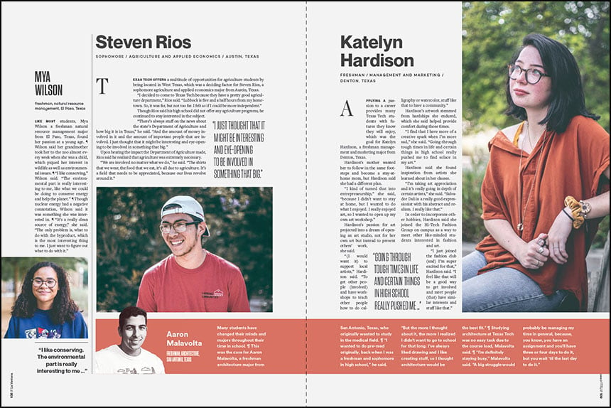 Profiles should play a significant role in 2021 yearbooks. In the 2020 La Ventana, Texas Tech featured numerous spreads with profiles, each including a feature story and photo of the student.
5. More storytelling
The changed environment means we should place more emphasis on storytelling. This is the year for personal stories. Think about doing something you’ve probably never done in a yearbook before—a long story format. A long story that might go across several spreads. This magazine-like approach will allow you to tell more in-depth stories and delve into aspects of school life that aren’t usually covered. In addition, trade out traditional design for profile spreads. Consider also swapping out traditional story blocks for alternative copy. This will give you the chance to feature more students. Q&As, quotes and mini-stories all make smart alternative copy choices.
 West Monroe High School, 2020
6. Anytime topic, showstopper design
Without our typical pep rallies and games to rely on, we’ll need to feature more “anytime” spreads. These tend to be student life topics that could run anywhere in the yearbook. They typically take on a wow, showstopper design, with full bleed photos, cutouts or graphics. Trends, T-shirts and hangouts are typical anytime spreads. But this year also think about masks, keeping busy and stress as potential topics. Need a few ideas? Check out our student life coverage post or the nifty four-page handout with 170+ideas.
You may have noticed all six concepts have a magazine quality to them. And that’s really the seventh and final suggestion. Look to professional publications for how they design. Notice the details on quick reads and graphic usage. Take inspiration from their creative use of typography and space. Let their expertise guide you into a whole new way of looking at yearbook. We know it can’t look like last year. And maybe, that really is, a good thing.
